How do I create a chart from a results set in Ask Your Data?
In Ask Your Data, you can easily convert your data tables into visual charts using the Chart Builder. Select from chart types like Bar, Pie, Line, Scatter, or Single Metric, then choose the relevant data types to generate visualizations that highlight trends and relationships. You can also zoom into specific areas of your chart for a closer look at your data insights.
Note: Sub-account administrators can use Ask Your Data (AYD) directly within their own sub-accounts, where AYD is scoped to display only the data relevant to that specific sub-account.
How do I create a chart from a results set in Ask Your Data?
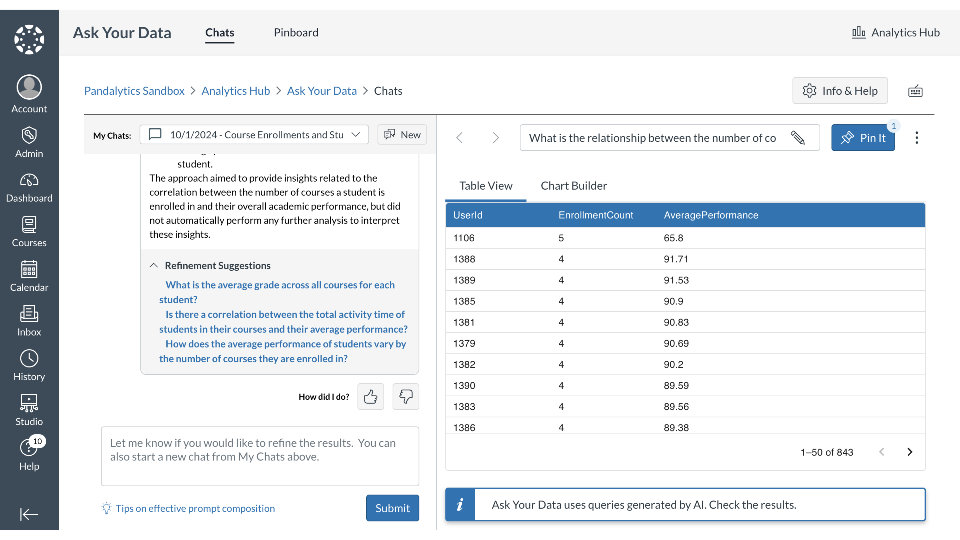
1. View Data Results Table
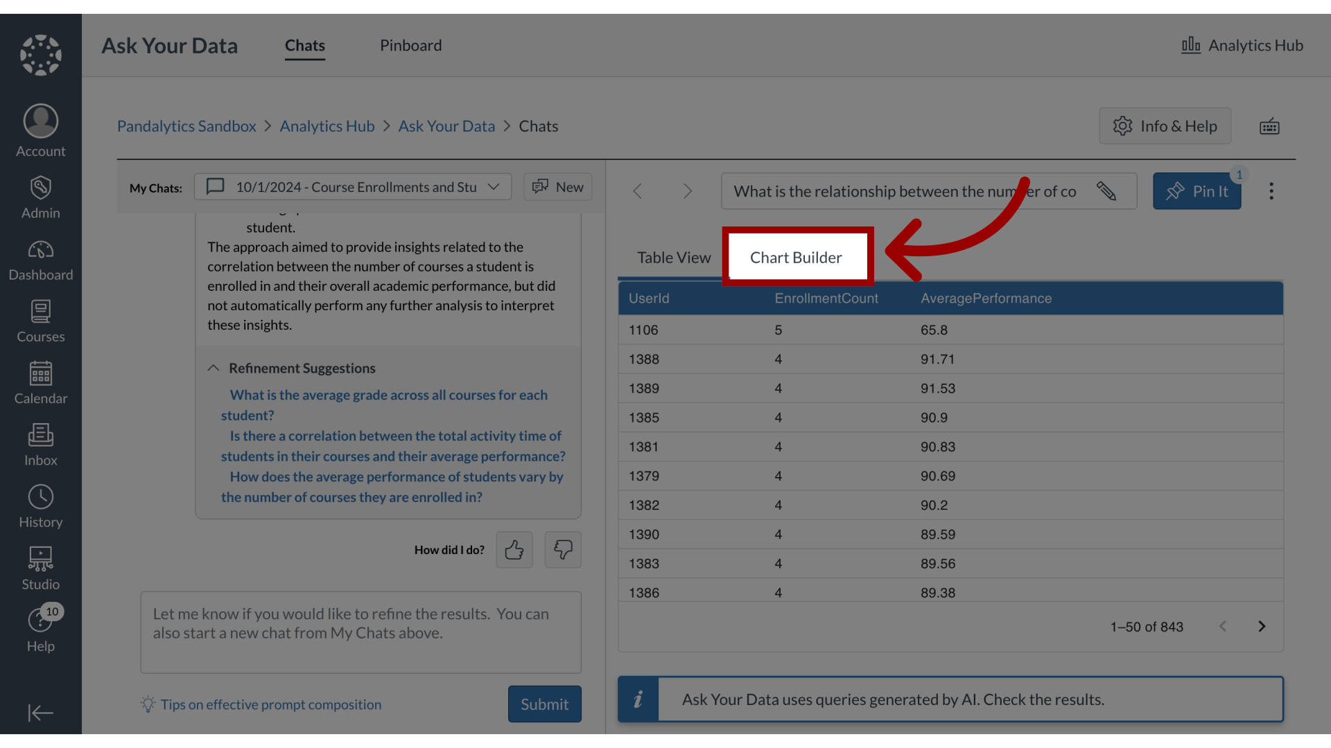
2. Open Chart Builder
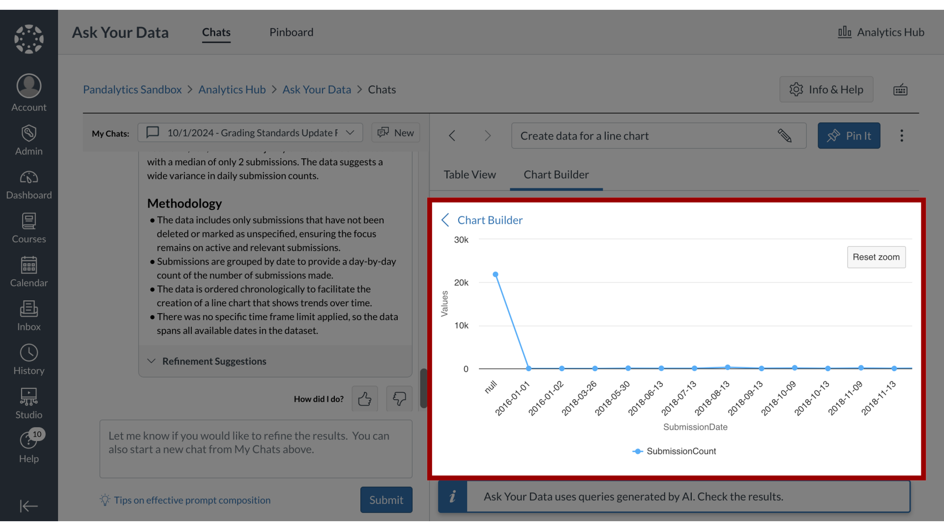
To view results set in a chart format, click the Chart Builder tab.
3. Select Chart Type
Select your chart type from the following options:
Bar Chart
Pie Chart
Line Chart
Scatter Chart
Some charts may not be available based on the data in the results set.

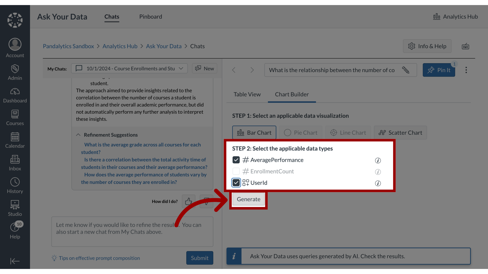
4. Select Data Types
Data types are presented as temporal, numerical or categorical data types. Select the applicable data types and click the Generate button. Some data types may not be available based on the chart selected.
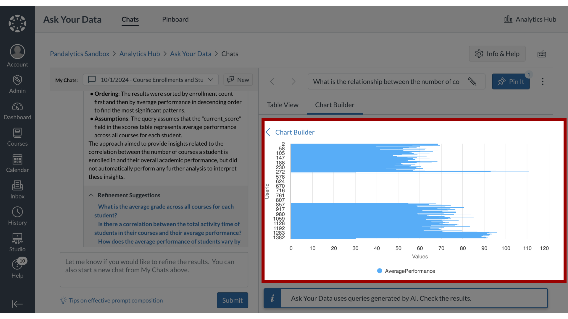
5. Bar Chart
The charts then display as your selected visualization.
Bar Charts present categorical data.
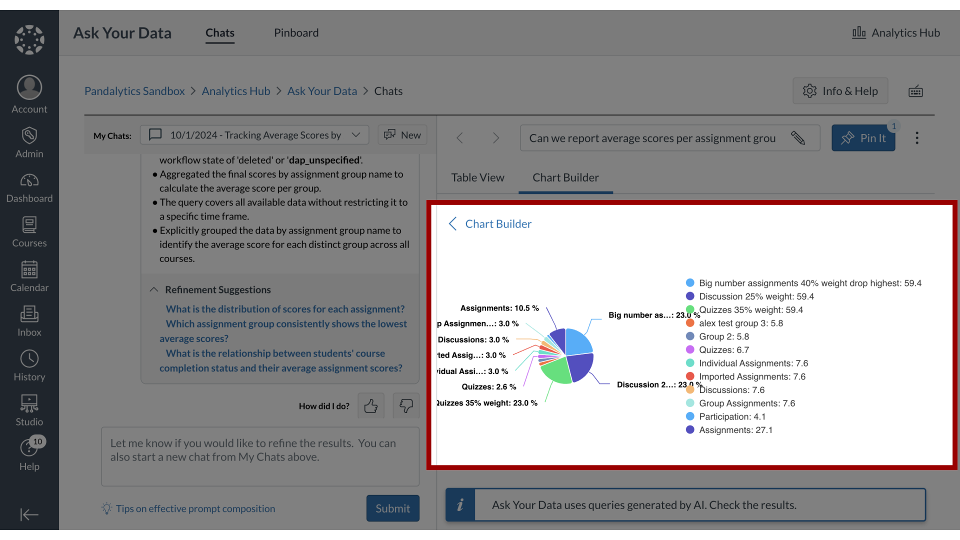
6. Pie Chart
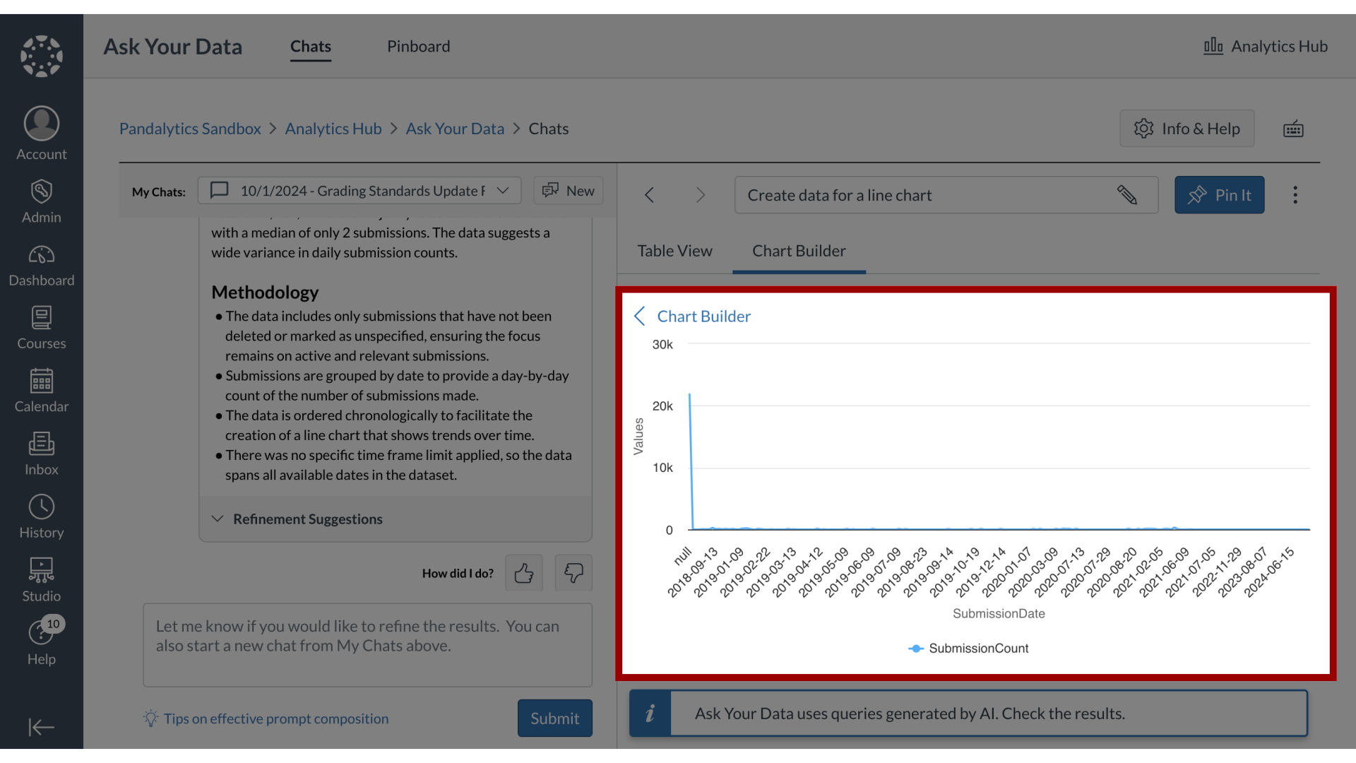
7. Line Chart
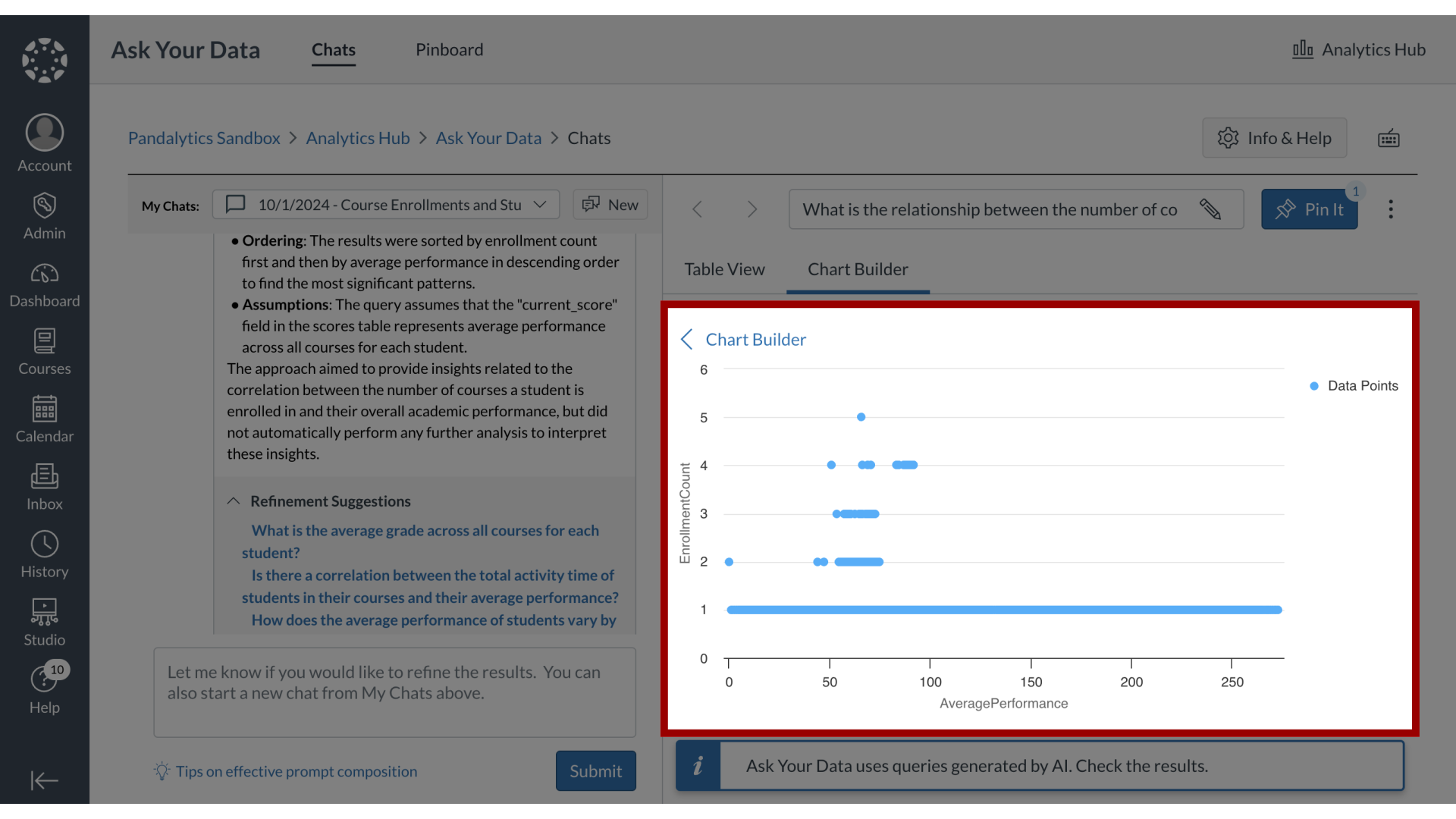
8. Scatter Plot
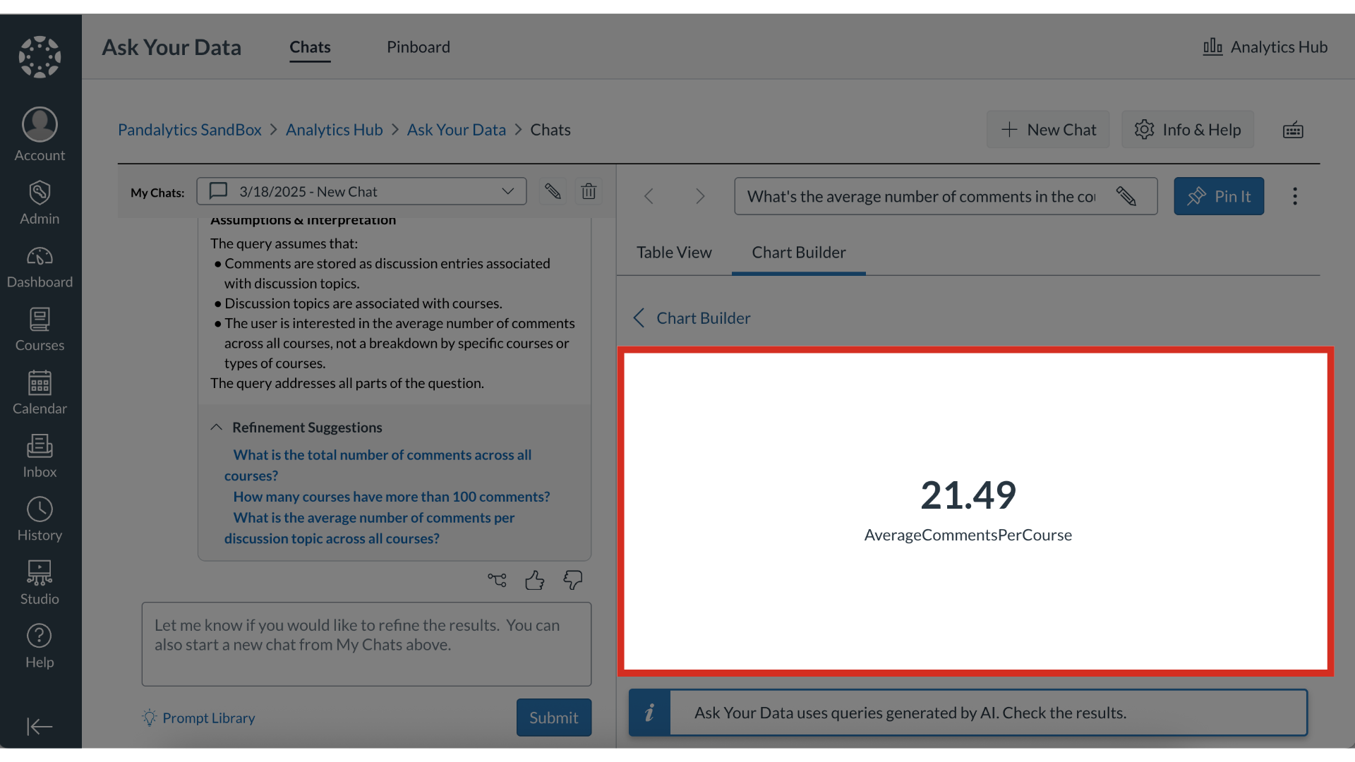
9. Single Metric
10. Focus on Highlighted Section
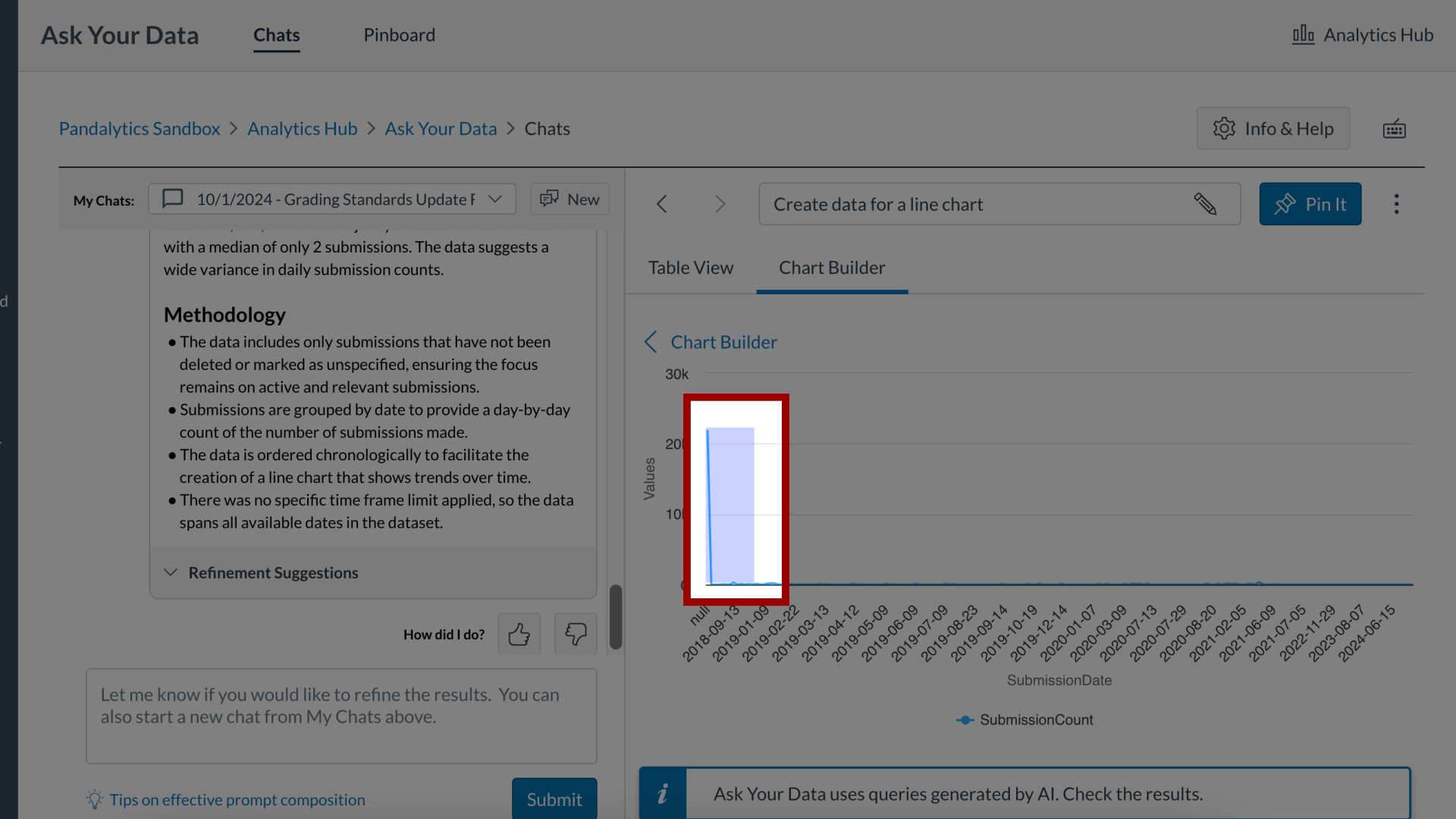
11. View Focused Area