How do I view the Tool Adoption Report in the Impact Dashboard?
The Tool Adoption Report is used to analyze usage data across your entire institution at a glance.
How do I view the Tool Adoption Report in the Impact Dashboard?
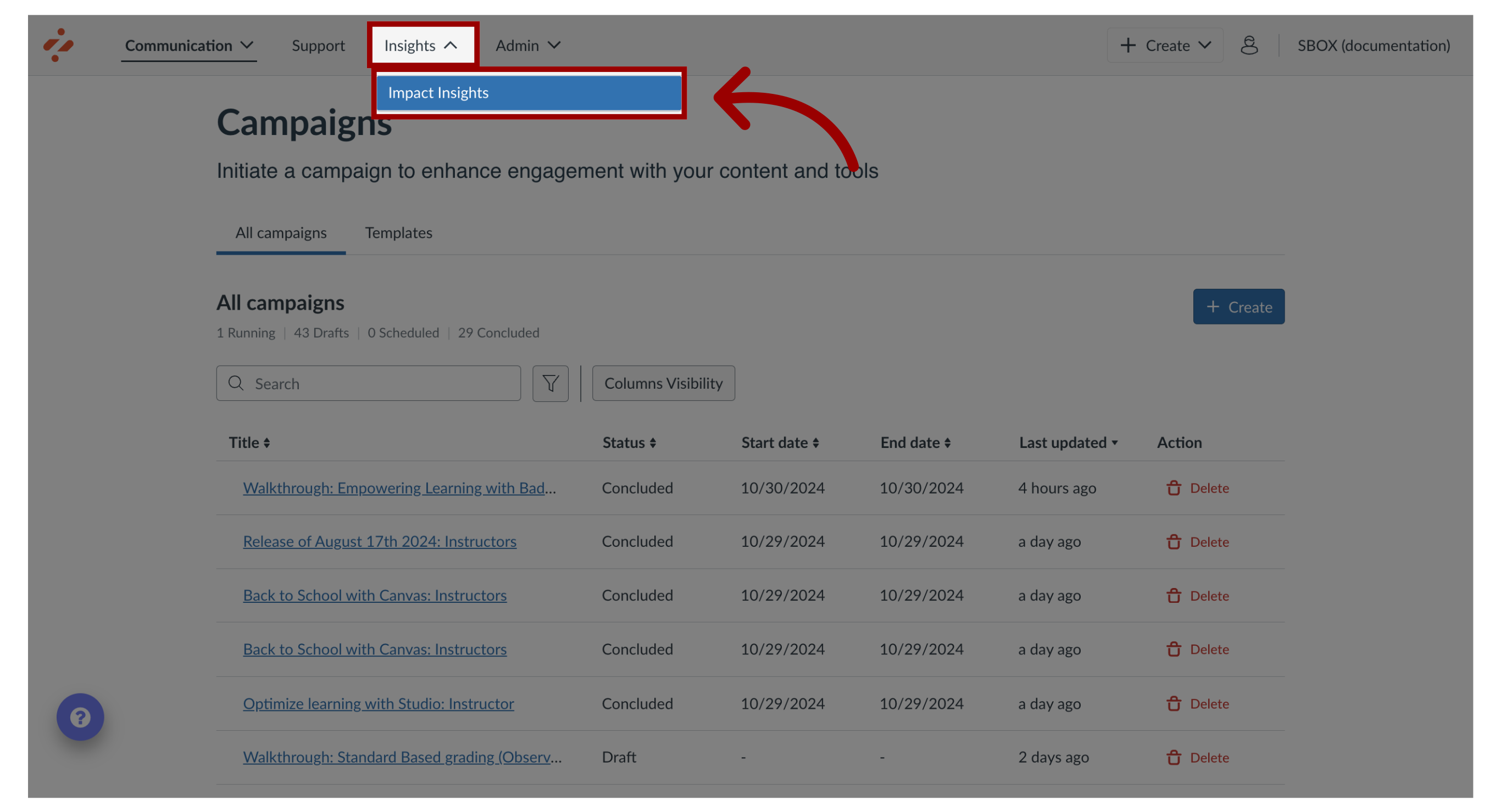
1. Open Impact Insights
In the Global Navigation, click the Insights dropdown menu. Then click the Impact Insights link.
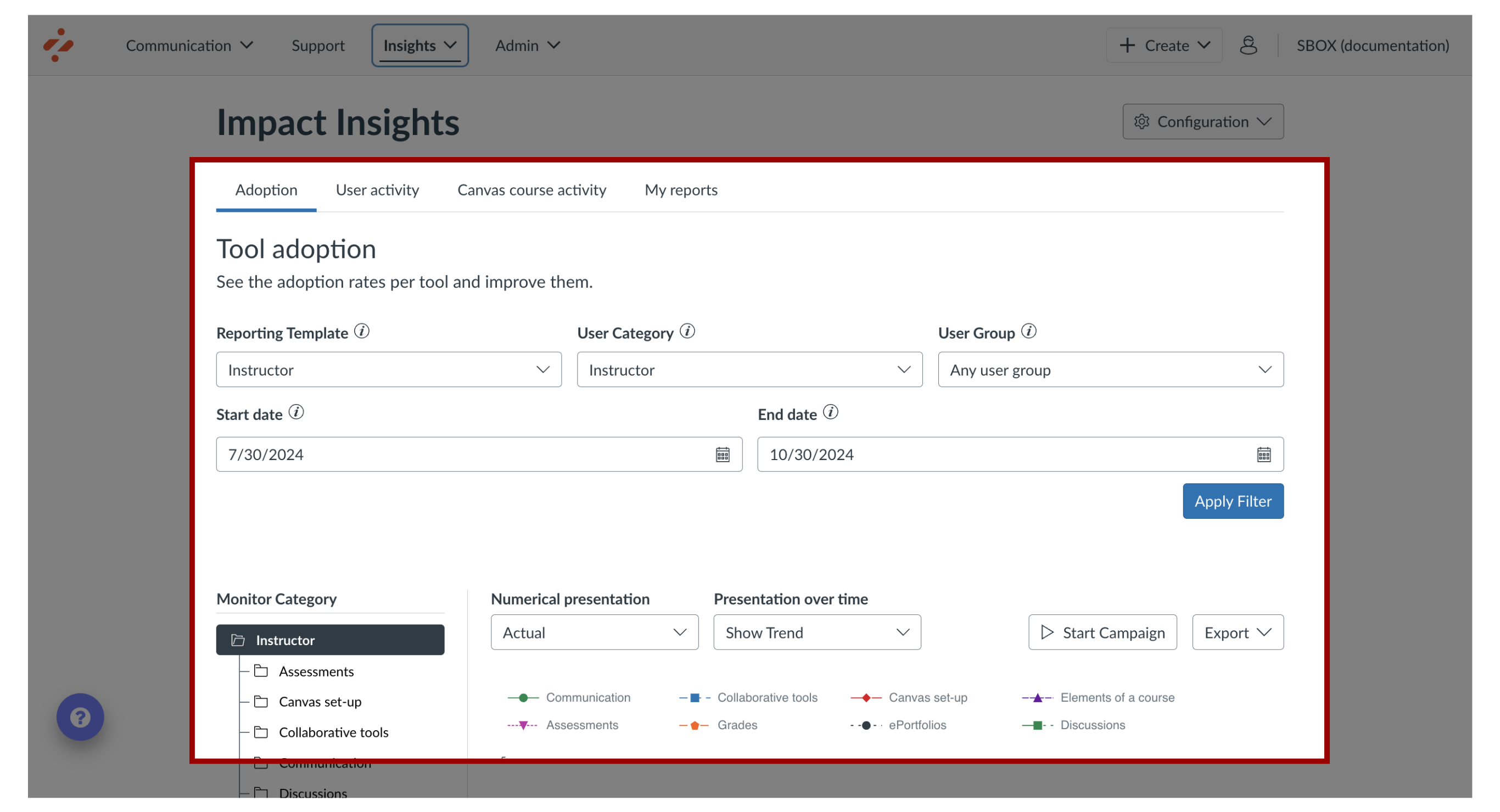
2. View Tool Adoption
The Tool Adoption Report displays by default.
3. Tool Adoption Data
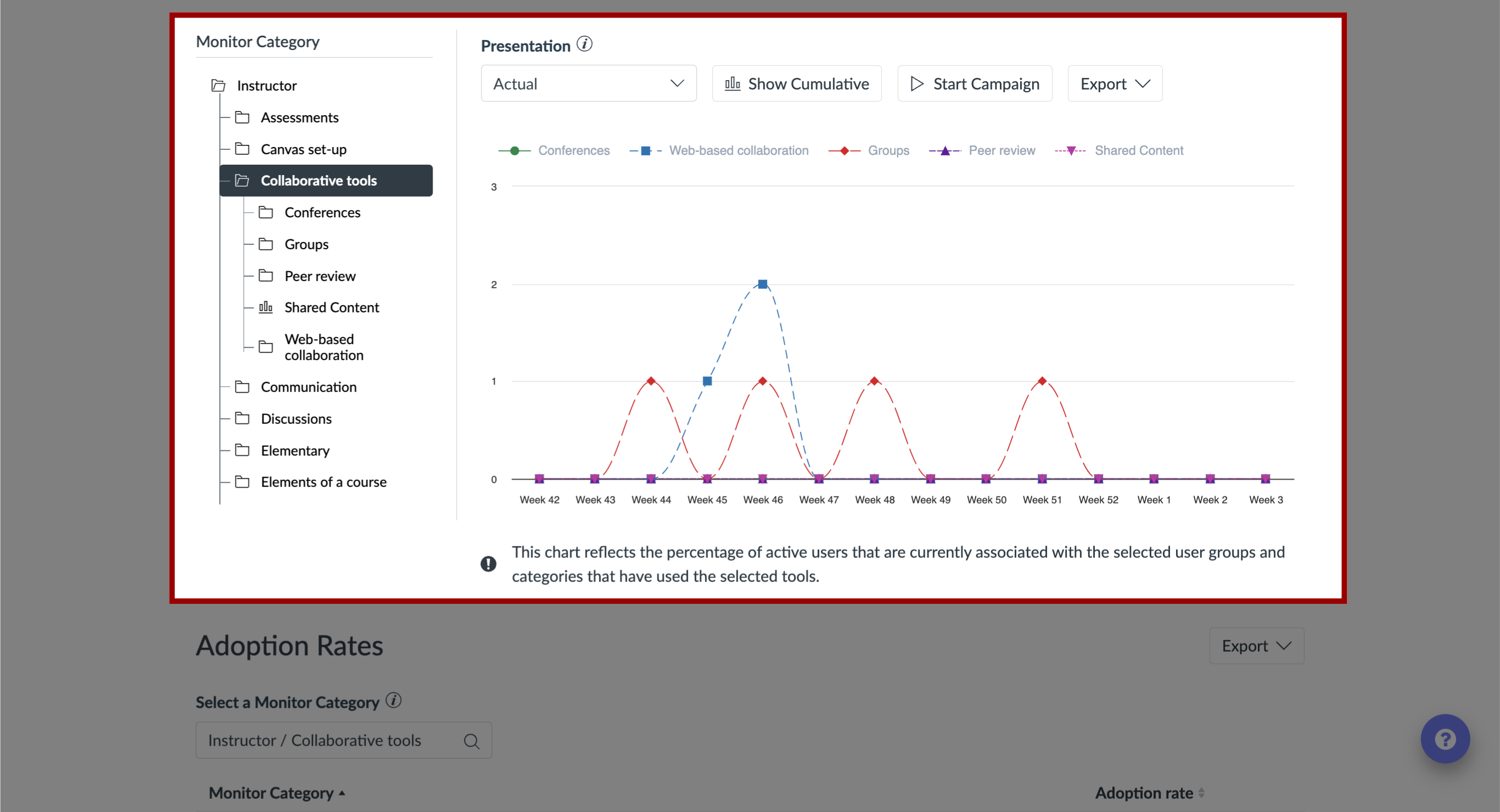
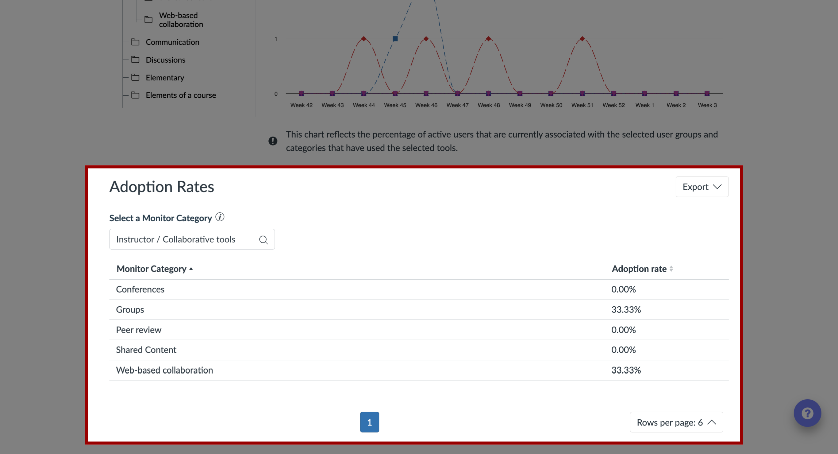
4. Adoption Rates
The Adoption Rates are calculated based on the number of unique active users that have logged in to the learning application over the selected time period and how many of them have triggered at least one monitor that lives underneath each monitor category or one of its child categories.
5. Filter Data
The data presented in the Tool Adoption Report can be filtered using the global filter bar at the top of the page.
In addition, the way in which the data is visualized can be controlled using the presentation options in the filter bar.
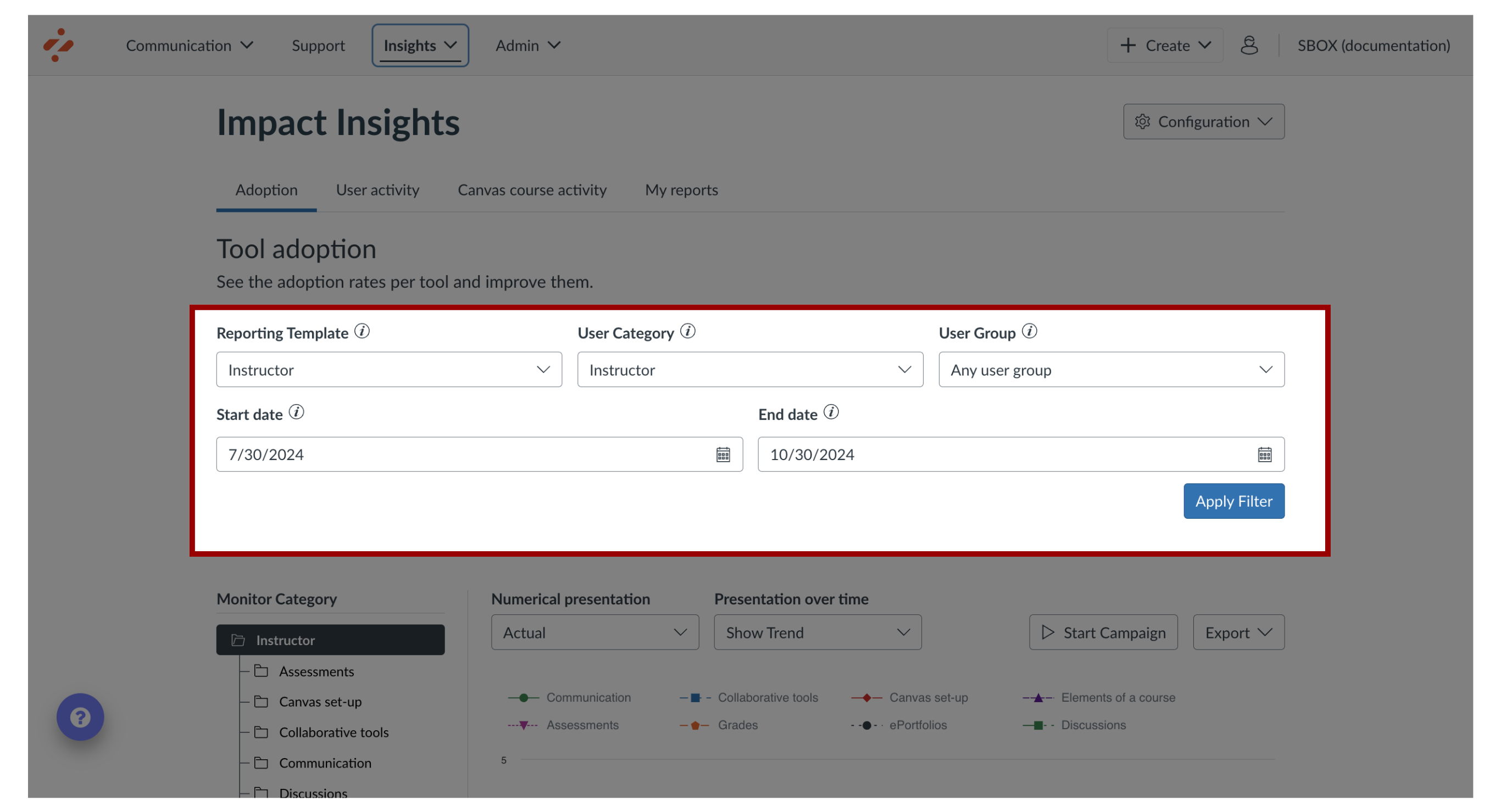
6. Reporting Template
To determine the structure shown in the chart and monitor category breakdown, click the Reporting Template drop-down menu and select the template you want to use.

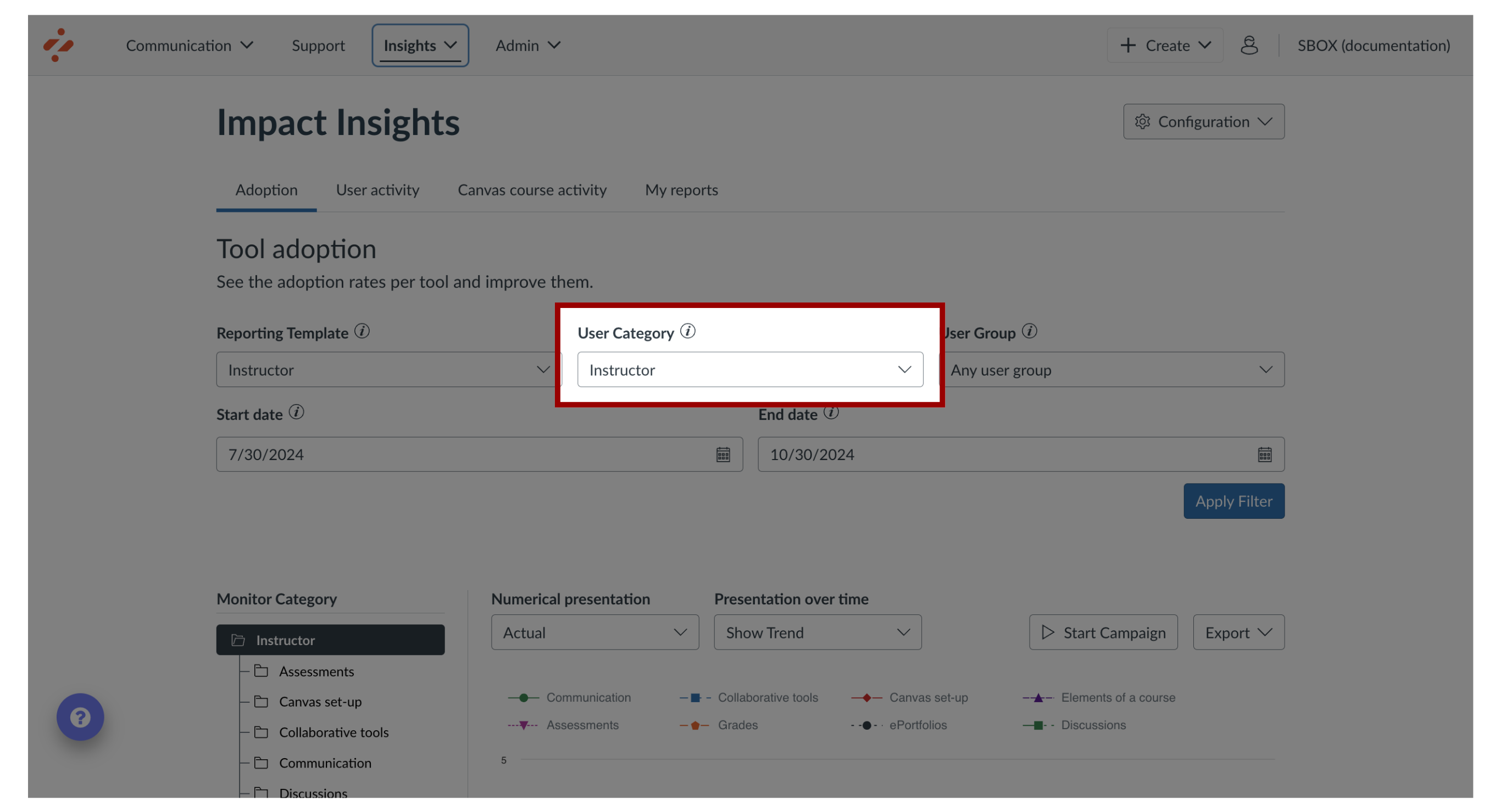
7. User Category
To limit the adoption data to users who belong to the selected, click the User category drop-down menu.
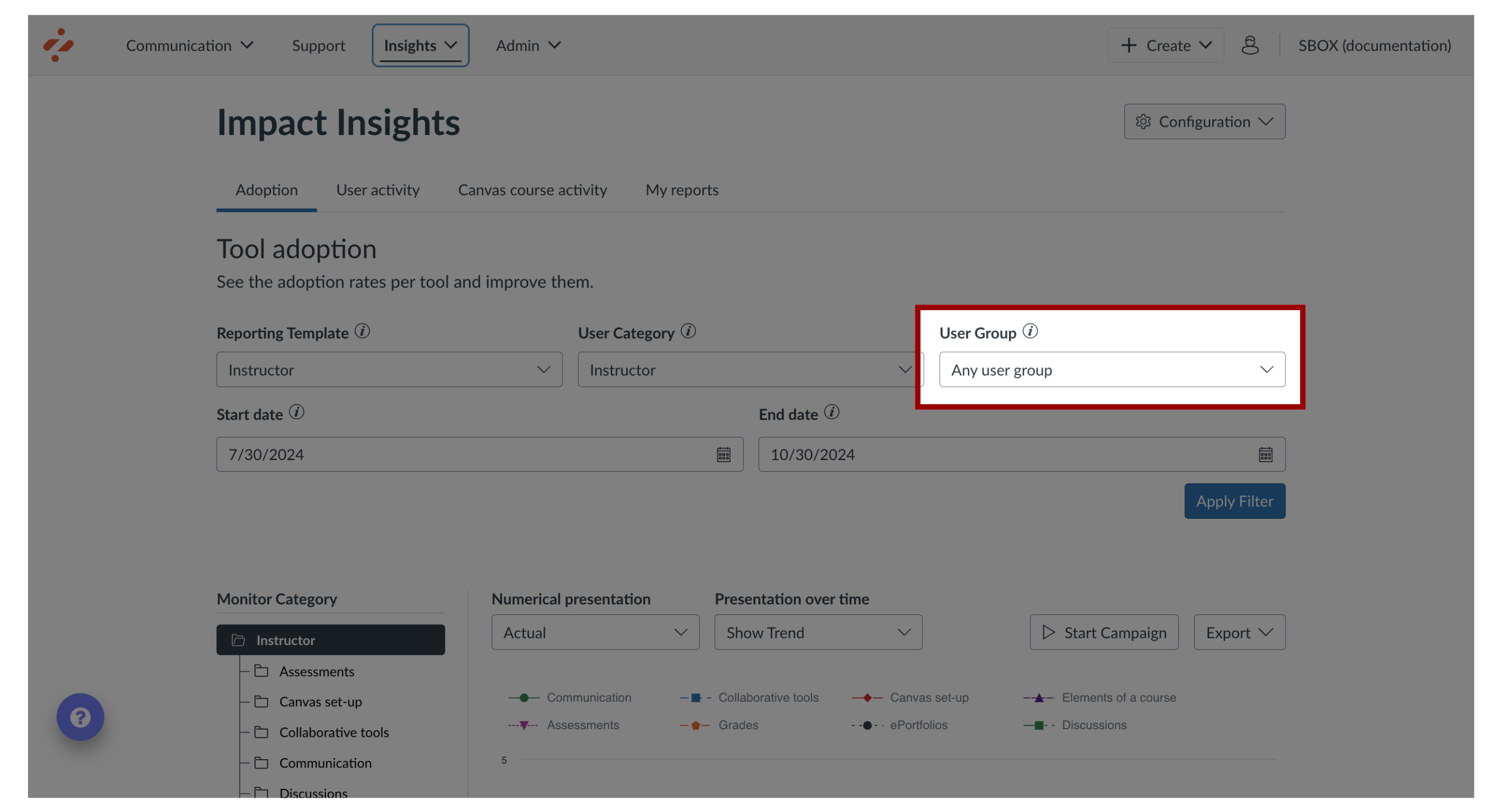
8. User Group
To filter on users belonging to individual roles and groupings that were registered from the learning application, click the User group drop-down menu.
9. Start and End Date
To modify the Start Date or End Date, click the Calendar icon. By default, the date range is set to a Start Date of three months before the current date and an End Date of today.
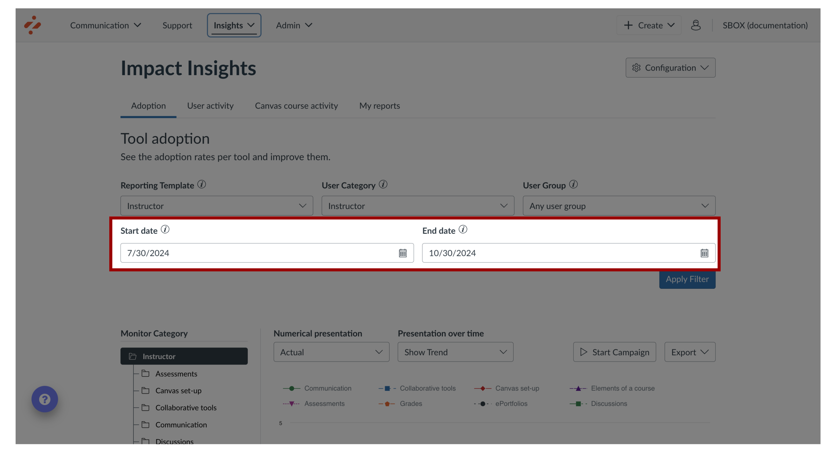
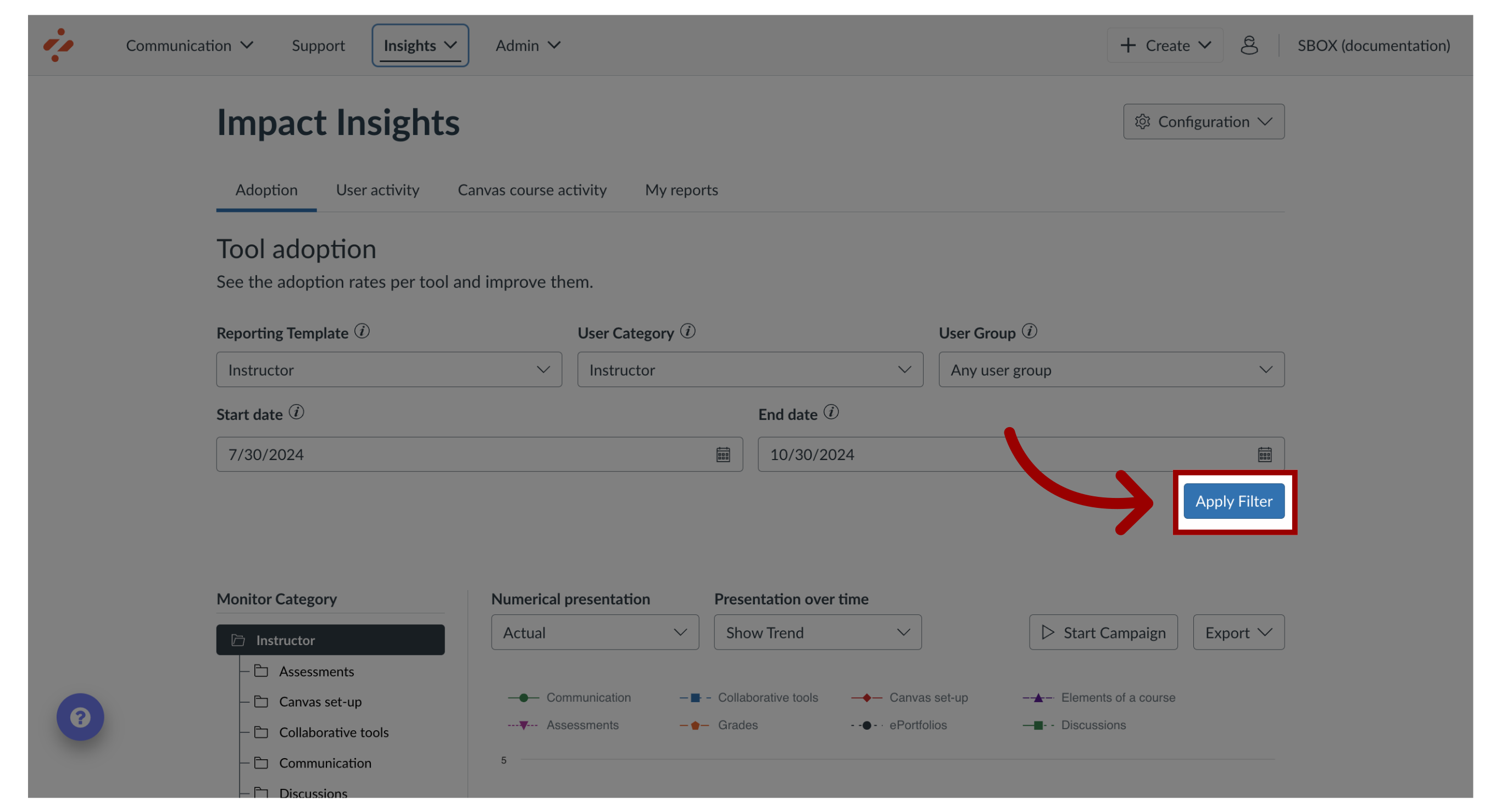
10. Apply Filters
To apply filters, click the Apply button.
11. Presentation View
To determine how the chart data is scaled and whether the adoption level for each monitor category is expressed in percentages or actual numbers, click the Presentation drop-down menu.
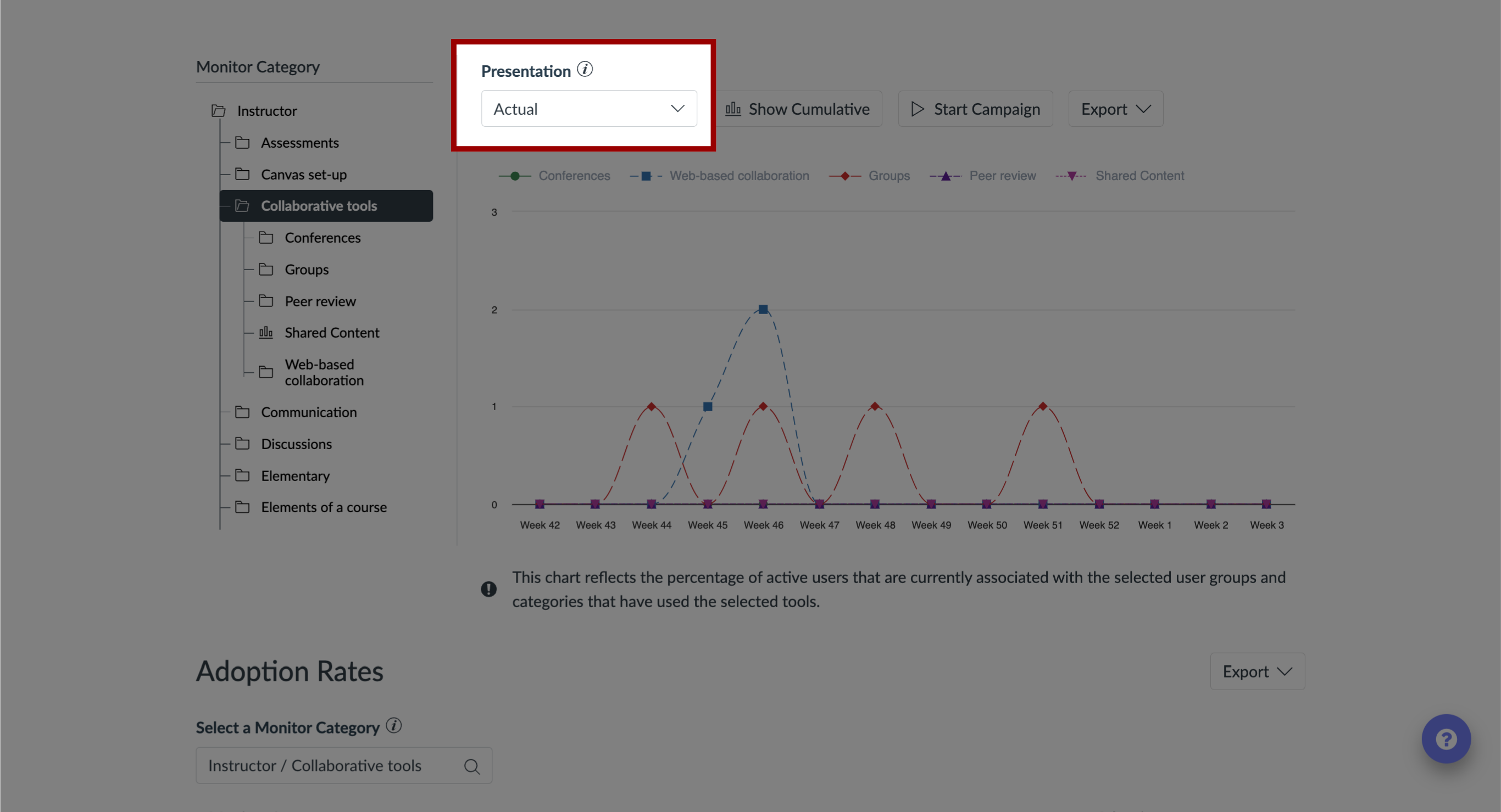
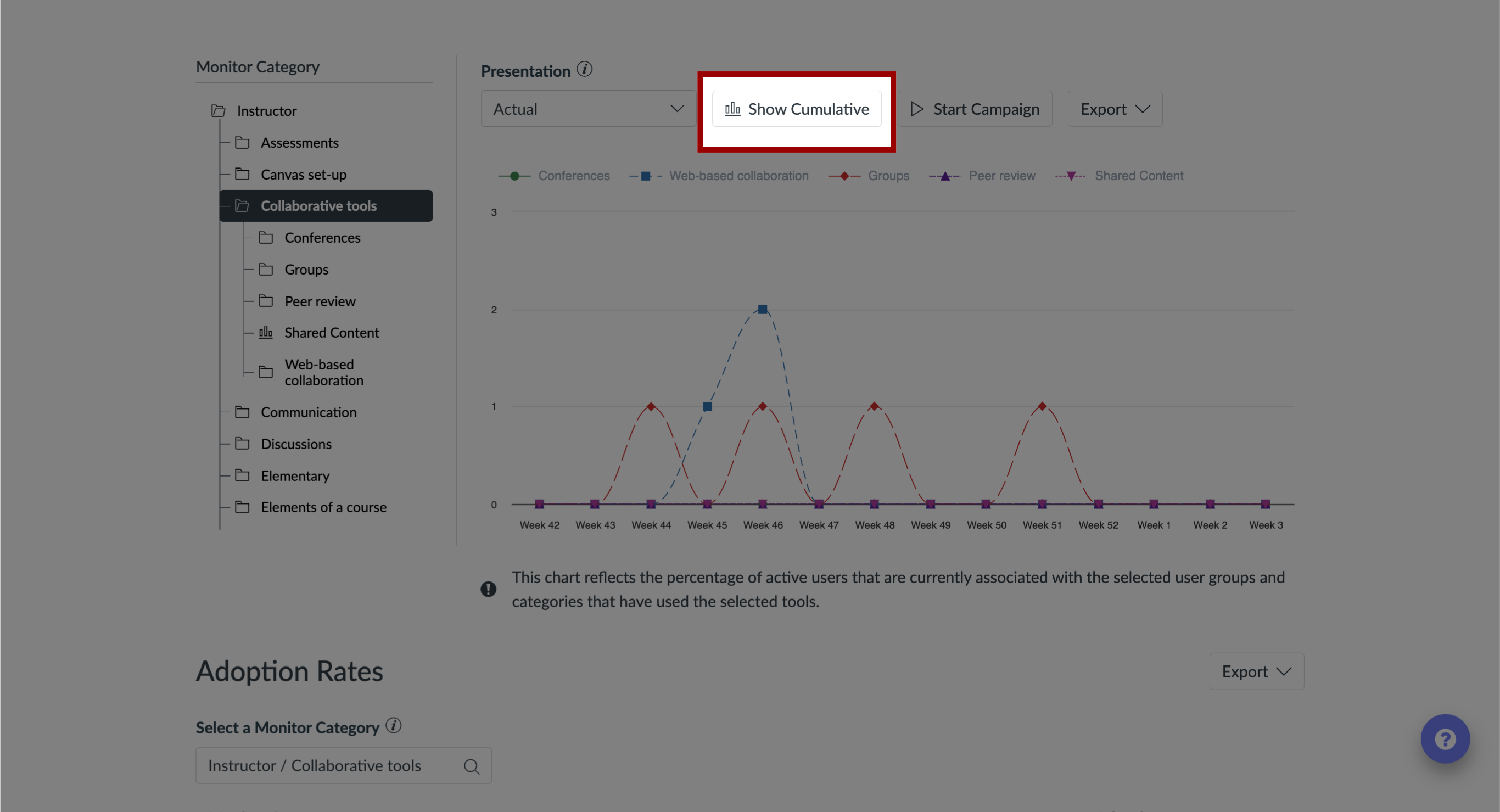
12. Chart Presentation
To toggle between Trend Line and Cumulative chart presentation, click the Graph Type button.
With Trend Line enabled, the chart shows separate adoption levels for each unit of time.
When set to the Cumulative Graph Type, the chart presents the growth curve of adoption from the first unit of time to the last unit of time.