How do I view the User Activity Report in the Impact Dashboard?
The User Activity Report analyzes how much time students and instructors spend using Impact and how they affect the load on the system.
How do I view the User Activity Report in the Impact Dashboard?
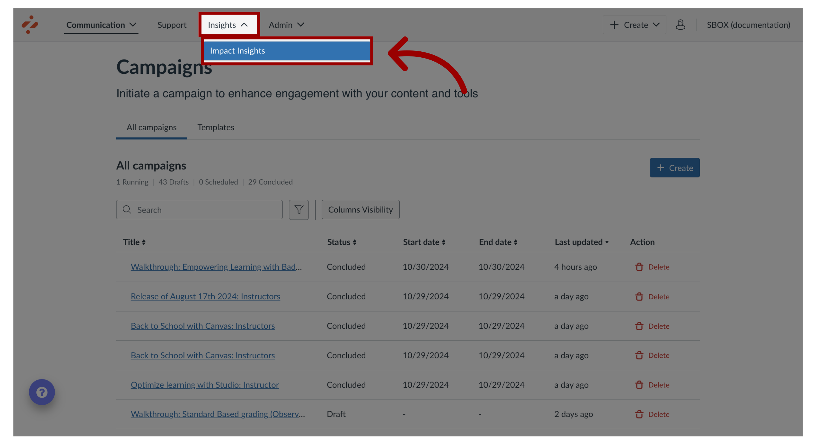
1. Open Impact Insights
In the Global Navigation, click the Insights dropdown menu. Then click the Impact Insights link.
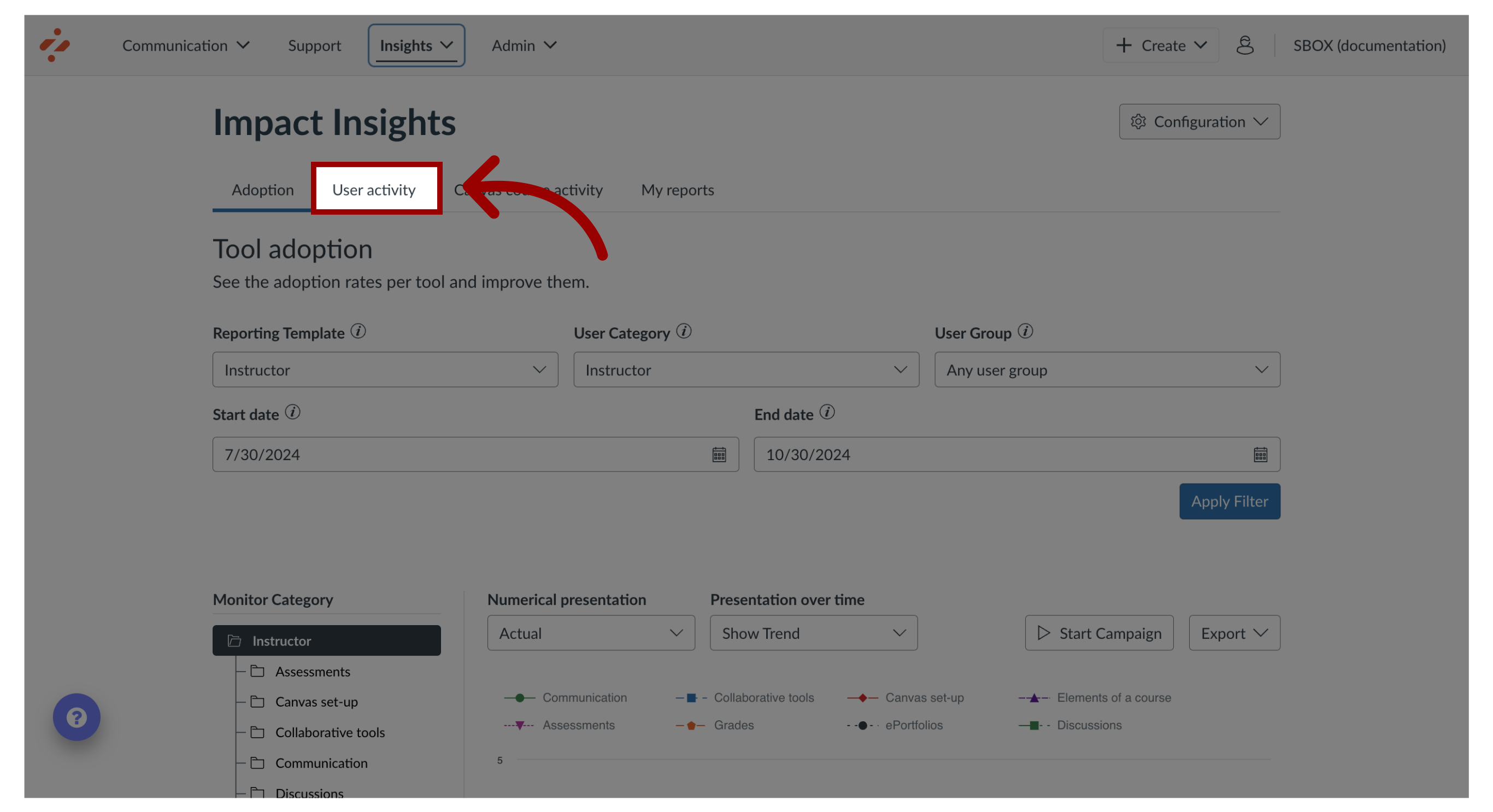
2. Open User Activity Report
Click the User Activity tab.
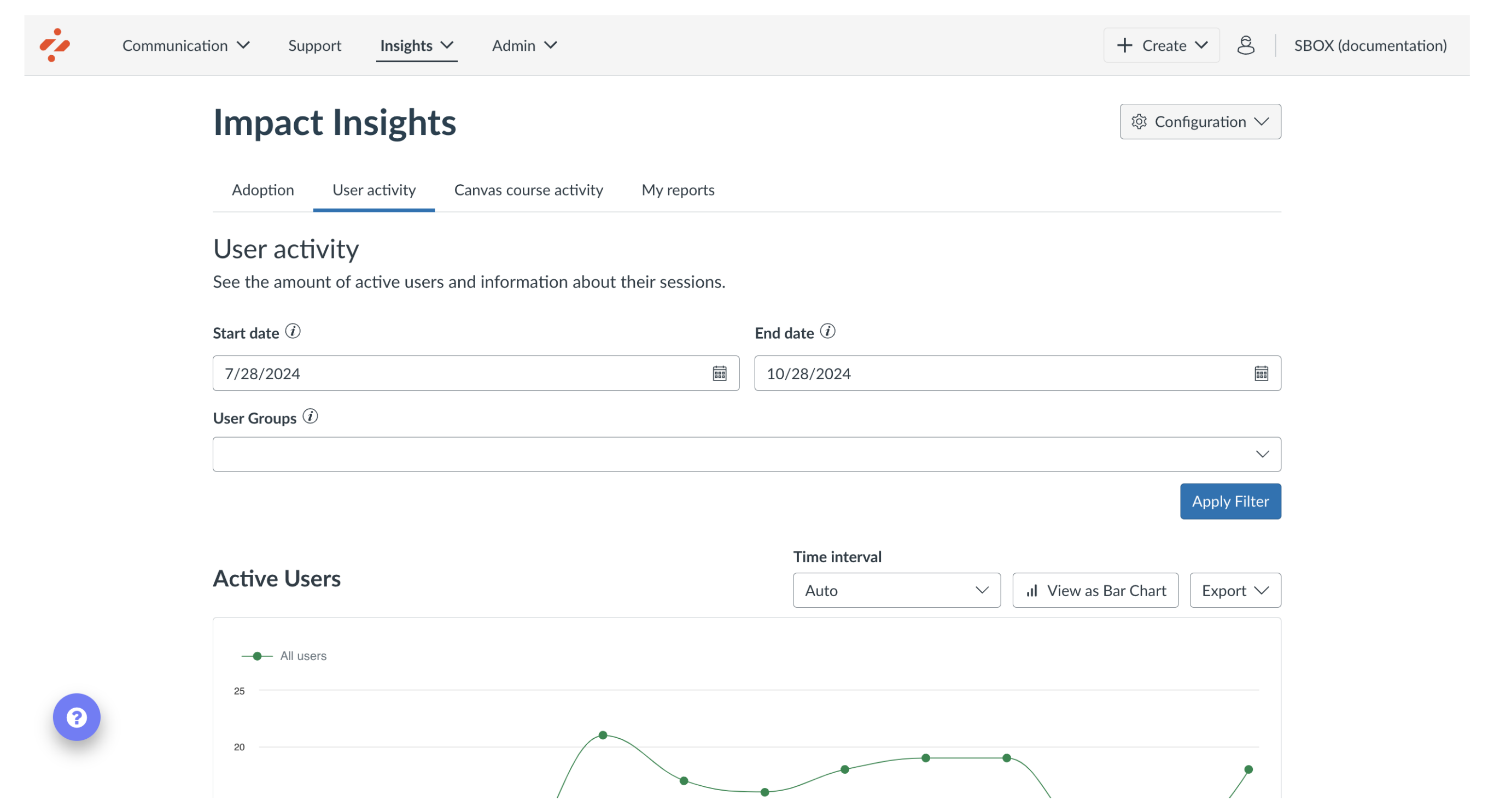
3. View User Activity Report
The User Activity Report contains four charts:
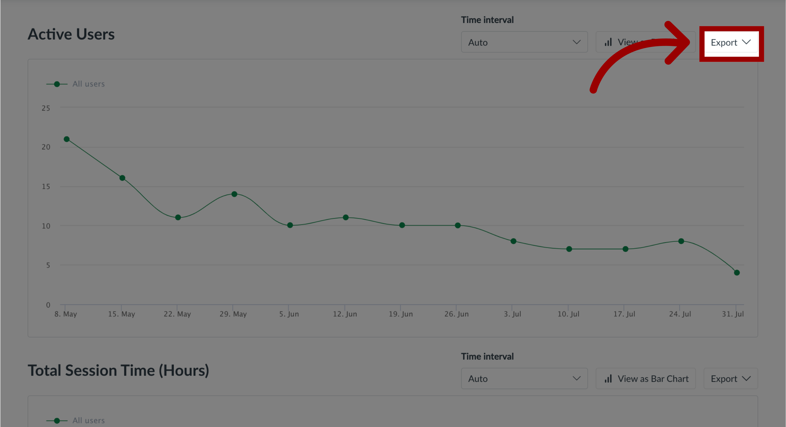
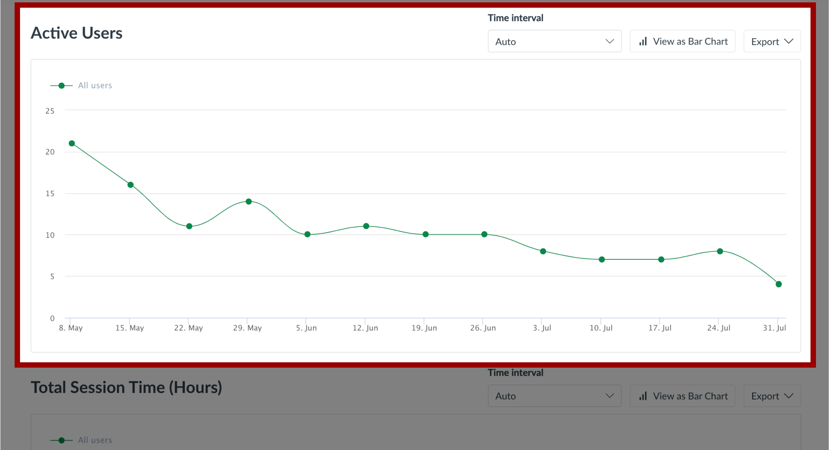
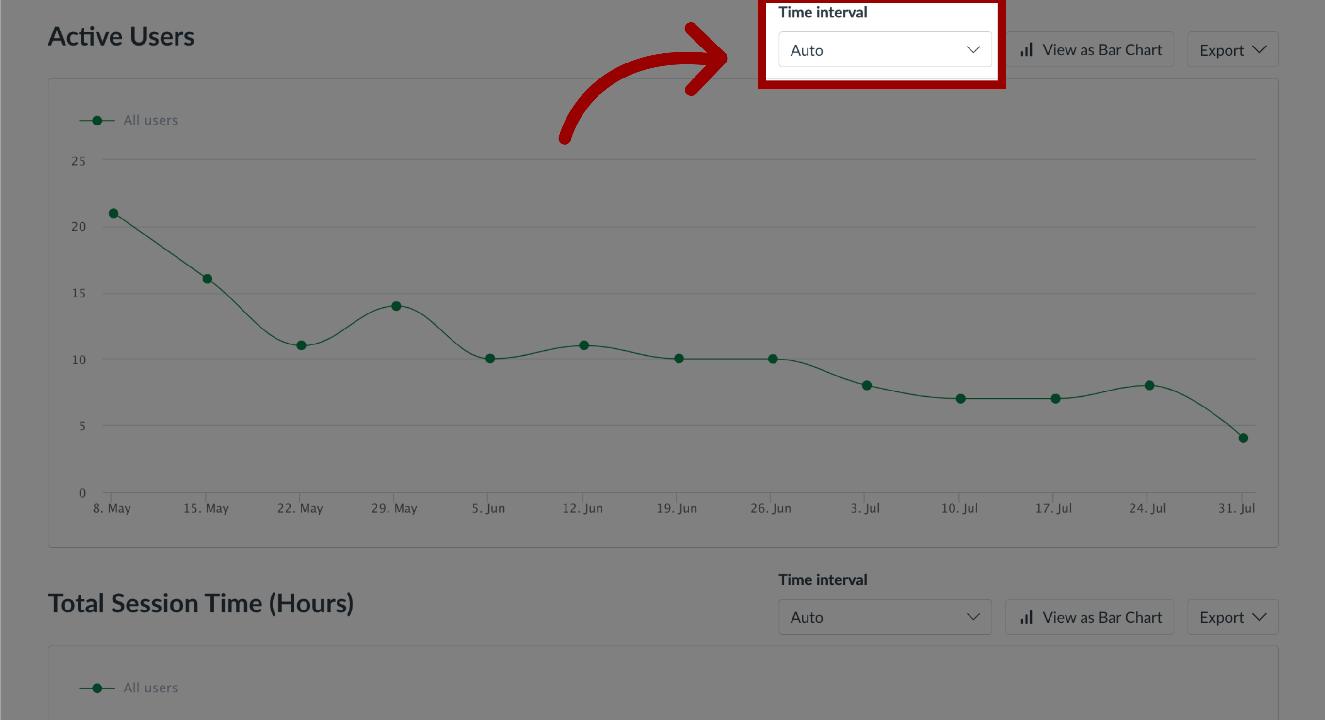
Active Users
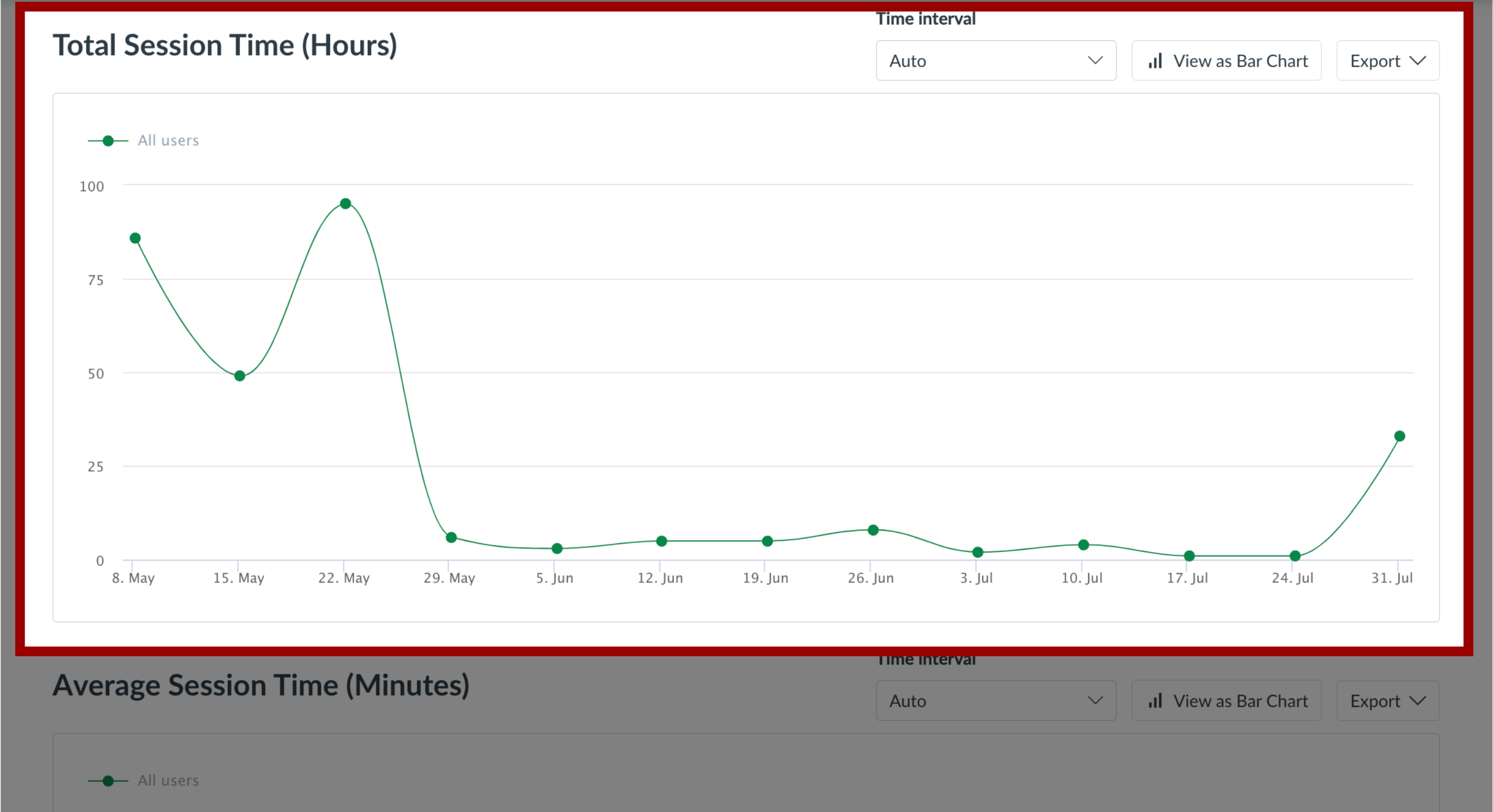
Total Session Time (Hours)
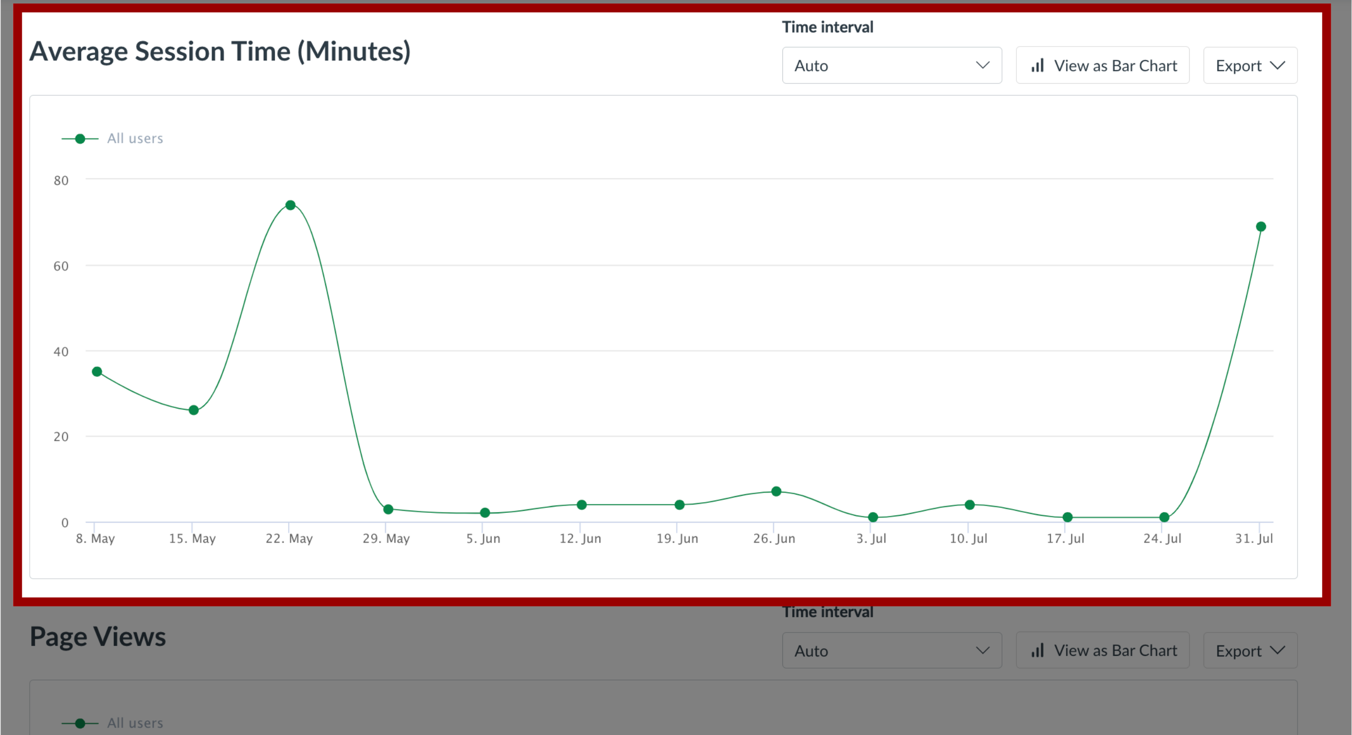
Average Session Time (Minutes)
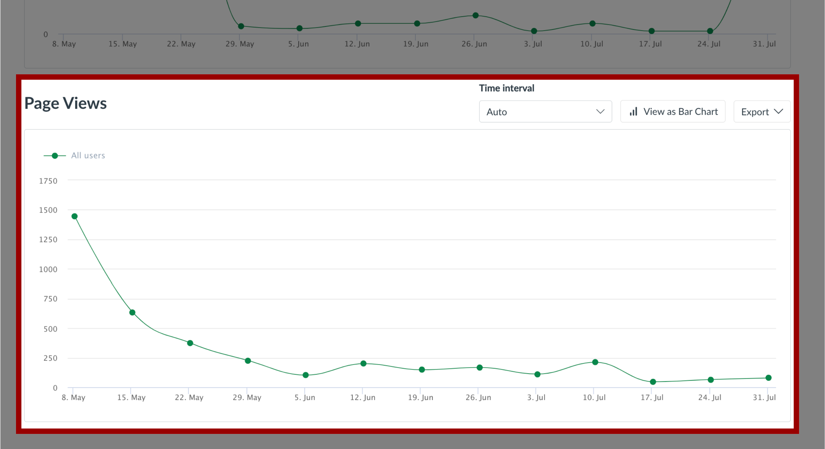
Page Views
These charts are related to overall activity within the learning application.
4. Active Users Chart
The Active Users chart shows the number of unique users that have accessed the learning application.
5. Total Session Time (Hours) Chart
The Total Session Time (Hours) chart displays the total number of hours that were spent in the learning application based on session time.
6. Average Session Time (Minutes) Chart
The Average Session Time (Minutes) chart displays the total time spent in the learning application divided by the number of active users, expressed in minutes per user per day.
7. Page Views Chart
The Page Views chart shows the total page loads performed to indicate how heavily the application has been used.
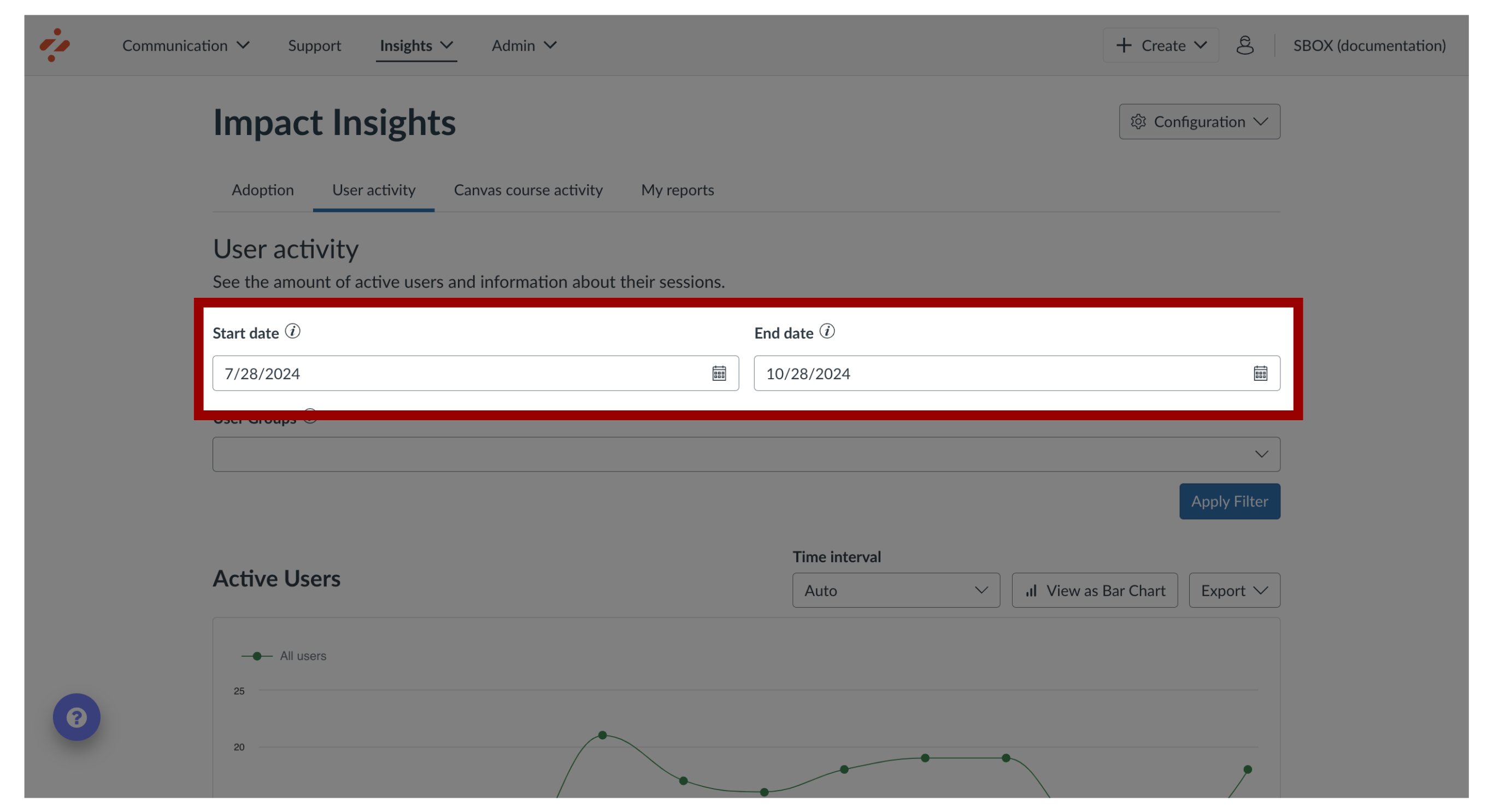
8. Select Date Range
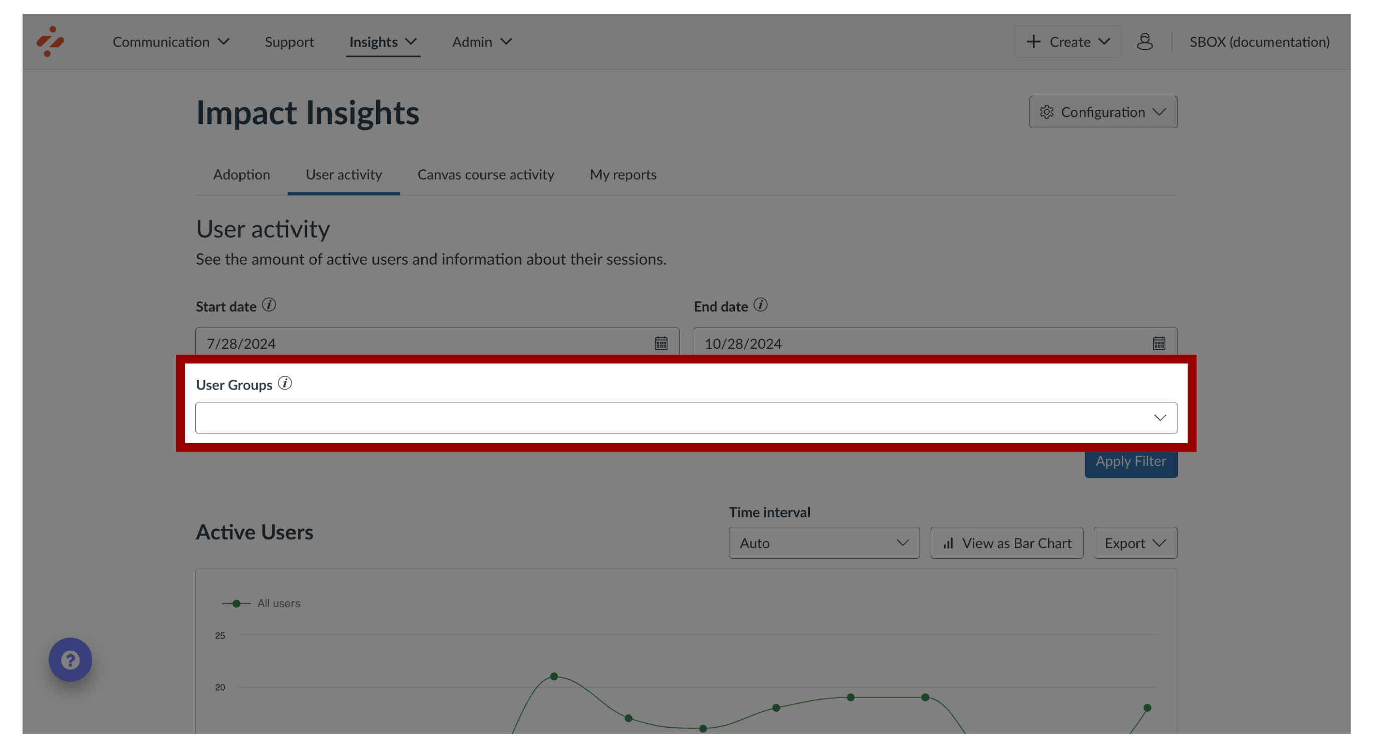
9. Select User Group
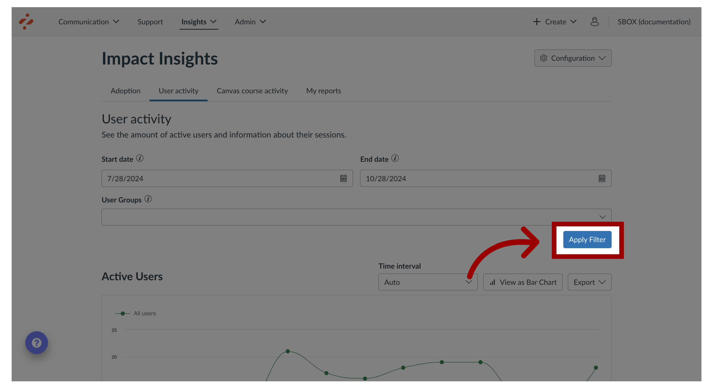
10. Apply Filter
Then click the Apply filter.
11. Time Interval
Each chart has an option bar that allows you to update the appearance and export the information.
To filter the time range, click the Unit of Time drop-down menu. You can select auto, day, week, month, or year options.
12. View Chart
To change the chart to show a line or bar chart, click the chart button.

13. Export
To export the data, click the Export drop-down menu. You can choose between data as a csv, chart as a pdf, or data as a pdf.