
How do I view campaign results in the Impact Dashboard?
You can access statistics related to how campaign messages and articles are being viewed and how tool usage among the campaign audience is impacted by your efforts.
How do I view campaign results in the Impact Dashboard?
1. Open Campaigns
In Global Navigation, click the Communication dropdown menu. Then click the Campaigns link.
2. Open Campaign
3. View Outcomes
Scroll to the Outcomes section.
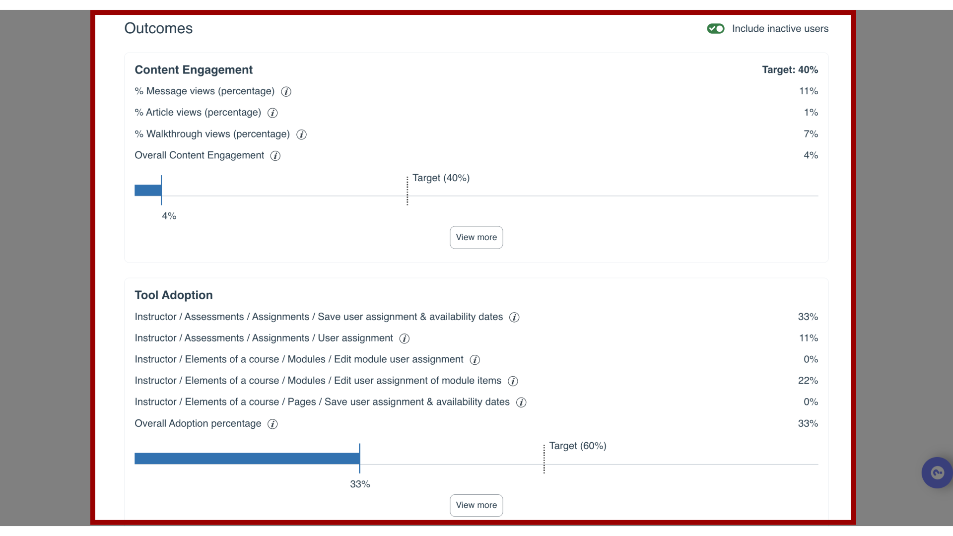
4. Content Engagement Quick Insights
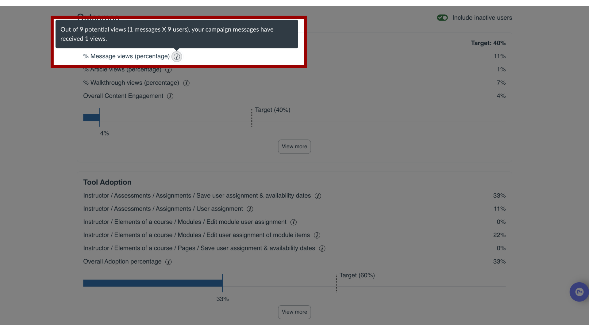
In the Content Engagement section, you are able to see which proportion of the campaign’s messages, articles, and walkthroughs has been viewed by which proportion of the campaign audience.
The overall engagement is broken down into message views (Initial Proactive Message Views) and support article views (Initial Knowledge Base Views).
5. Content Engagement Tooltips
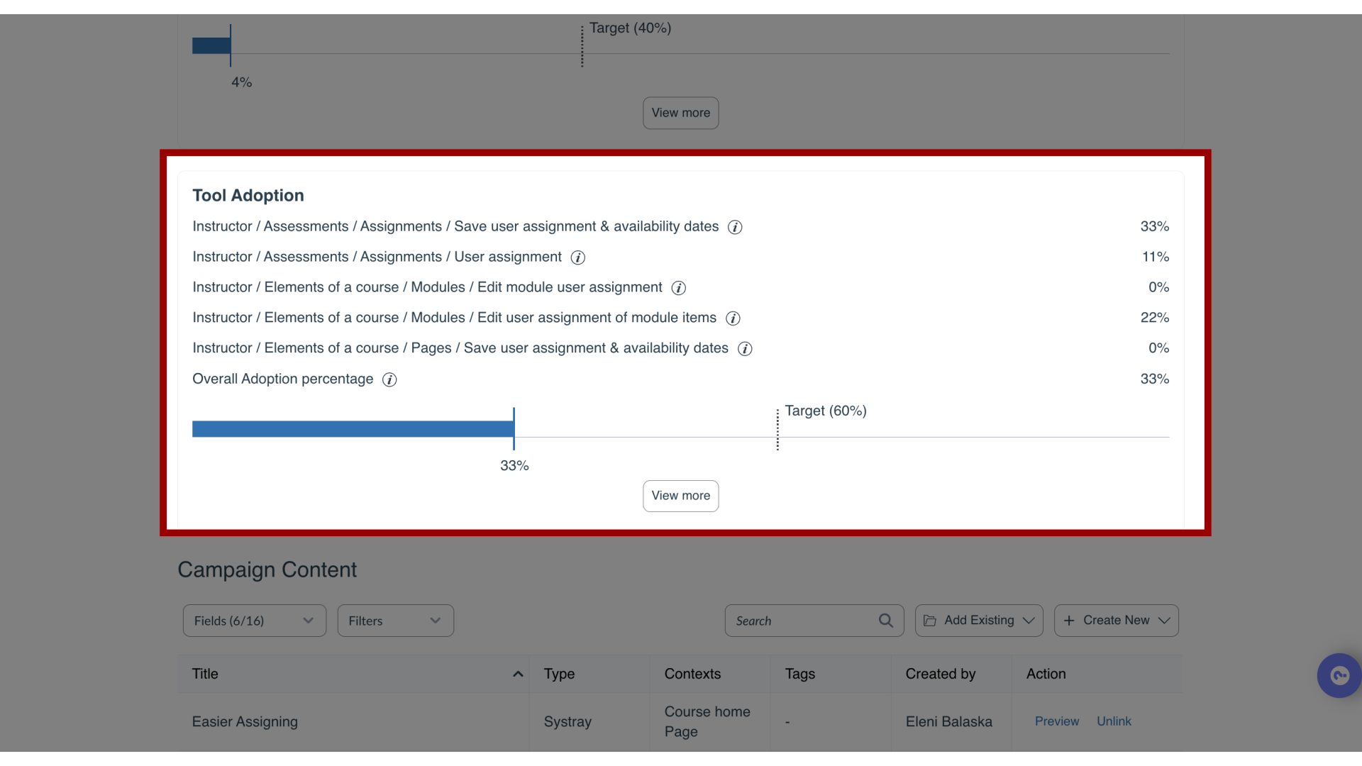
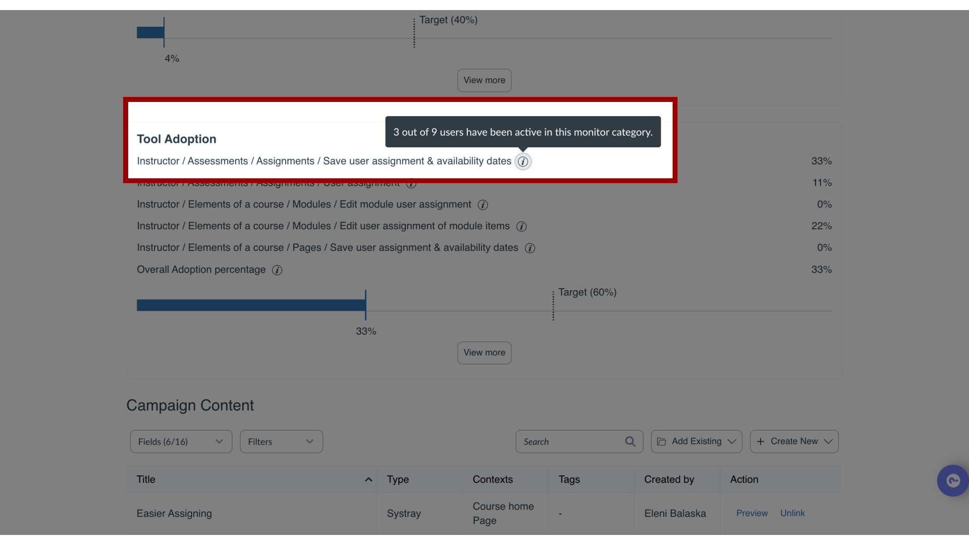
6. Tool Adoption Quick Insights
7. Tool Adoption Tooltips
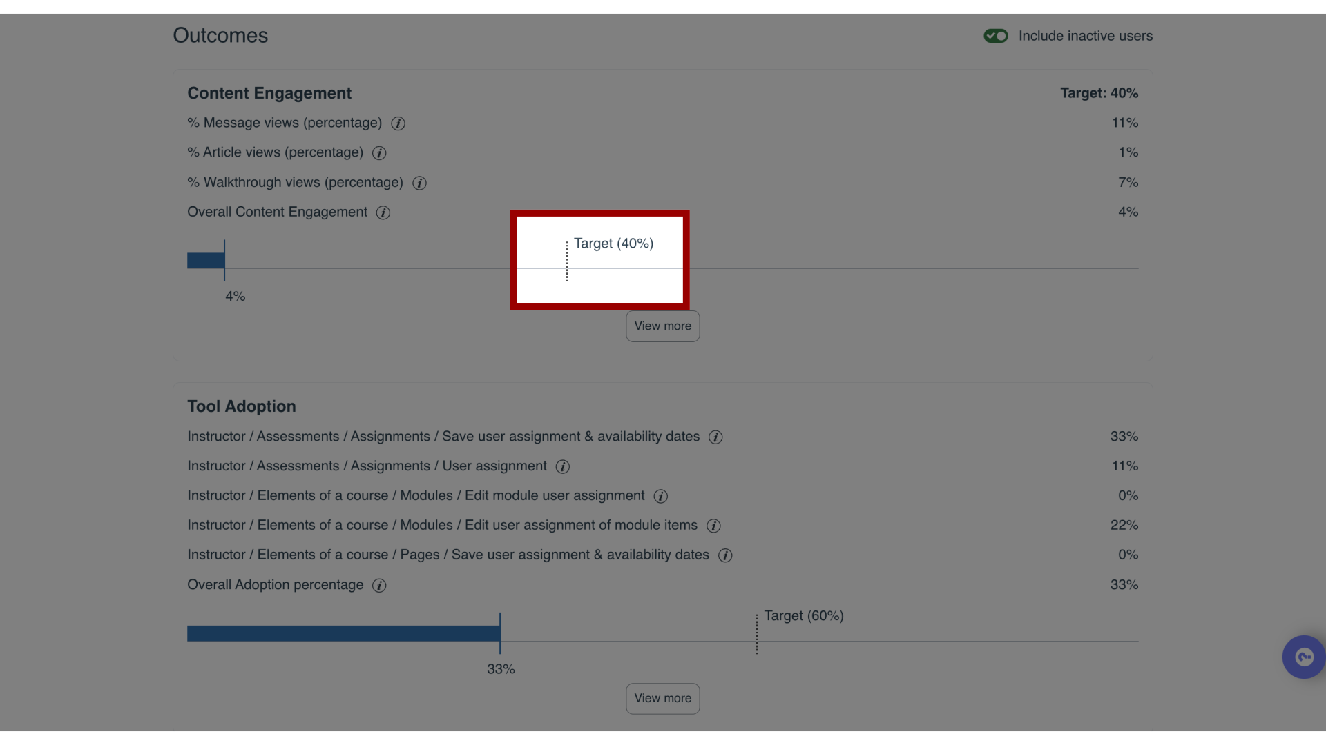
8. Target Goal
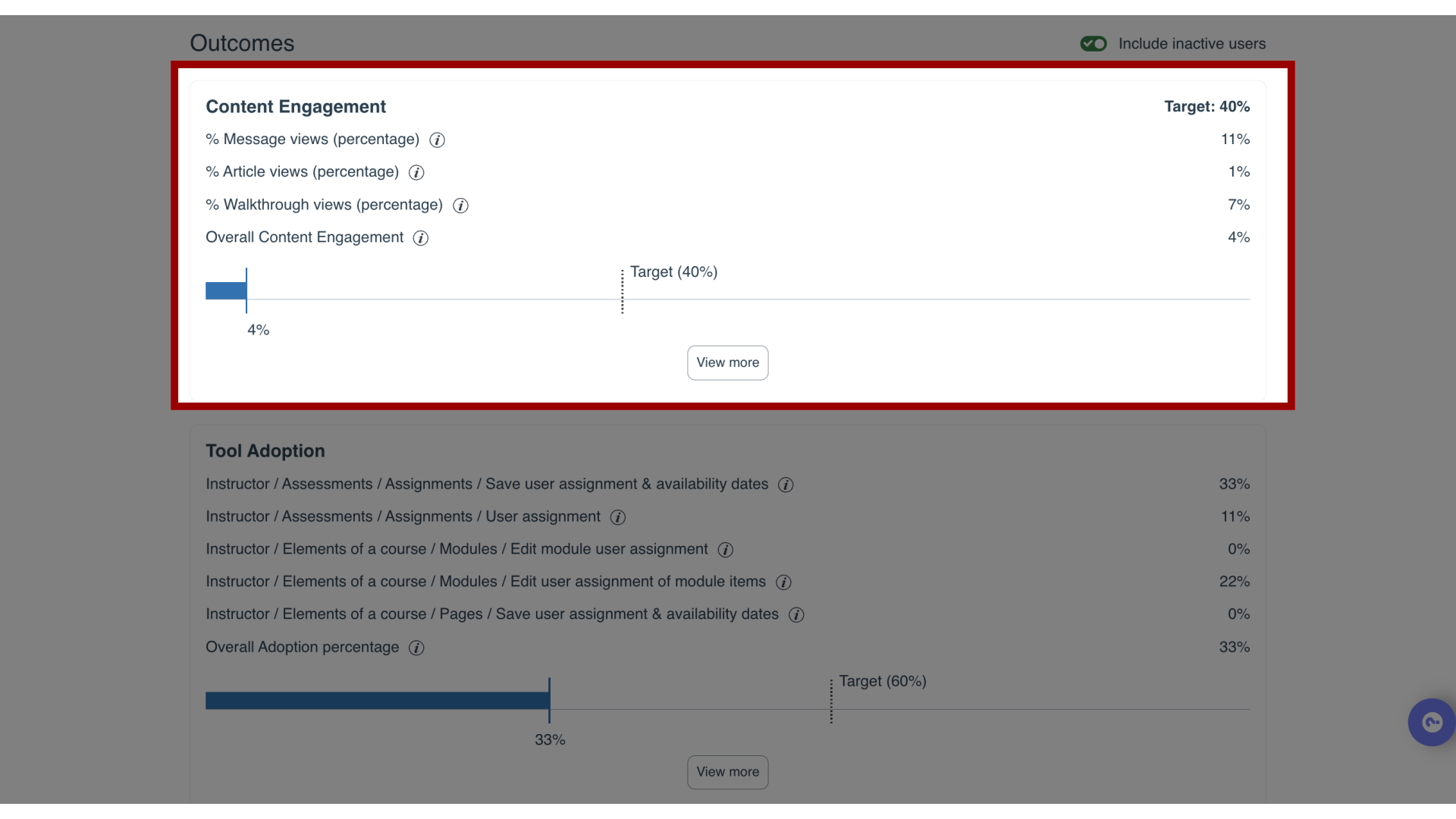
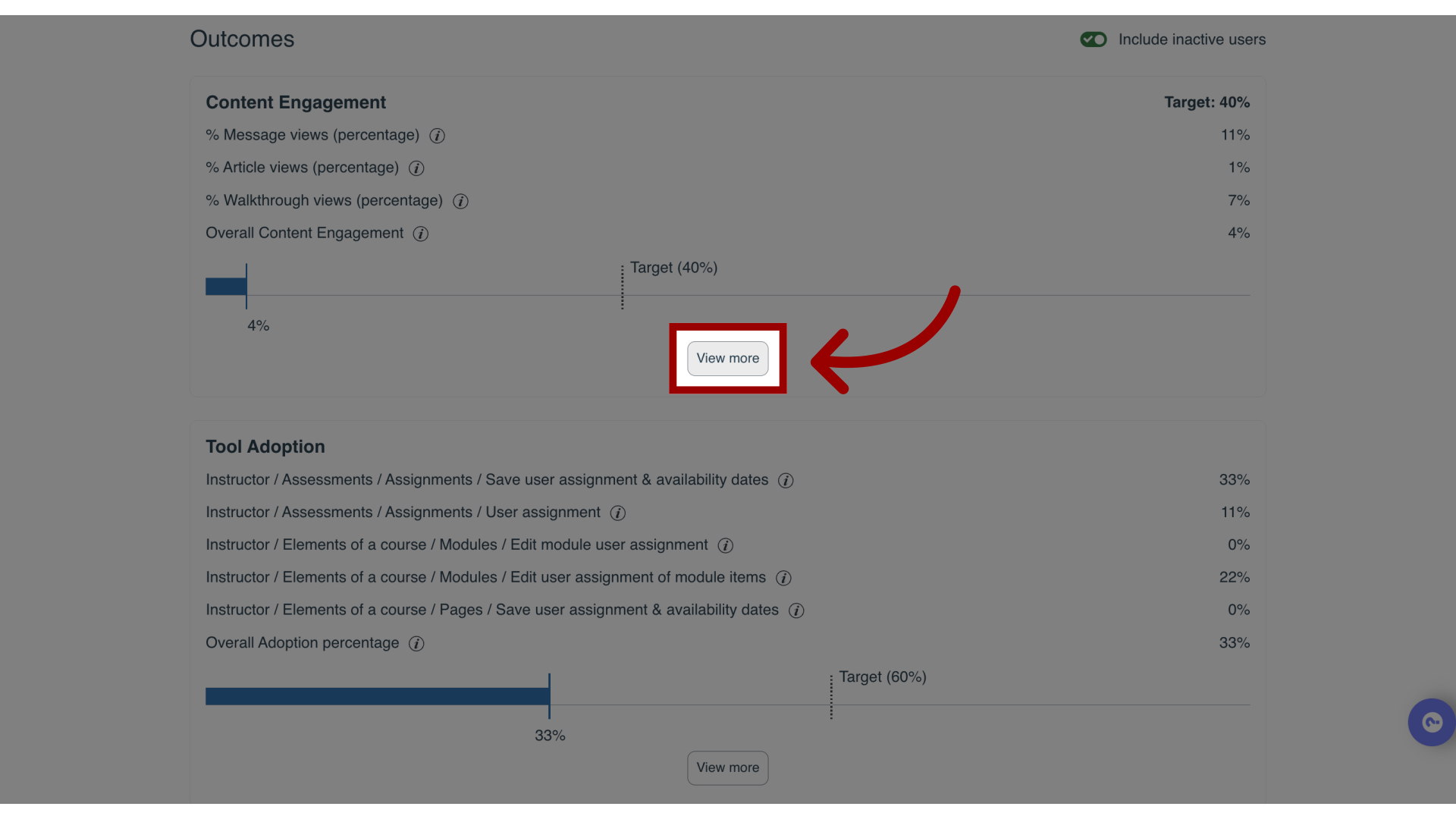
9. Analyze Content Engagement
In the Content Engagement section, click the View more link to view message and article statistics in more detail.
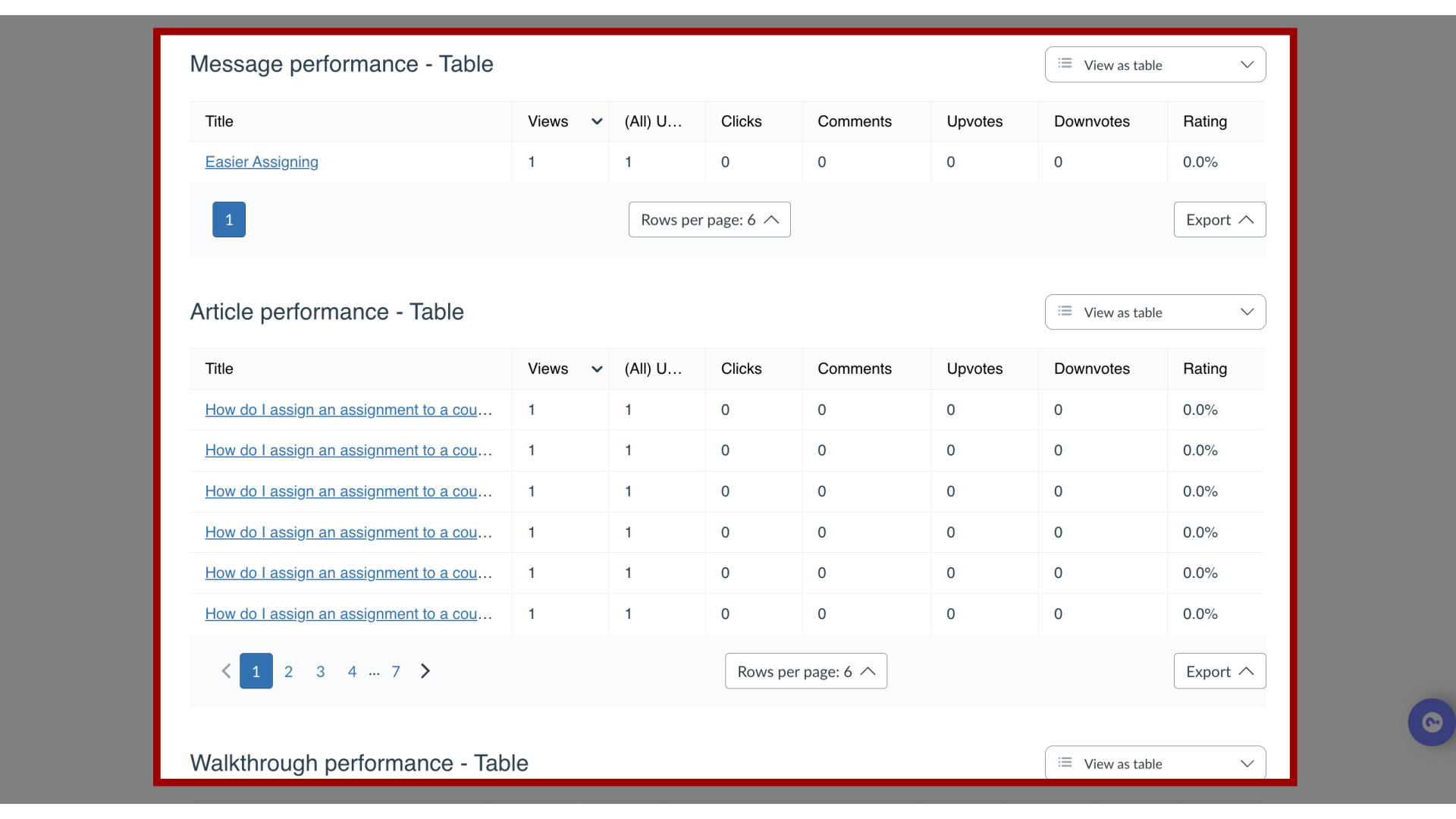
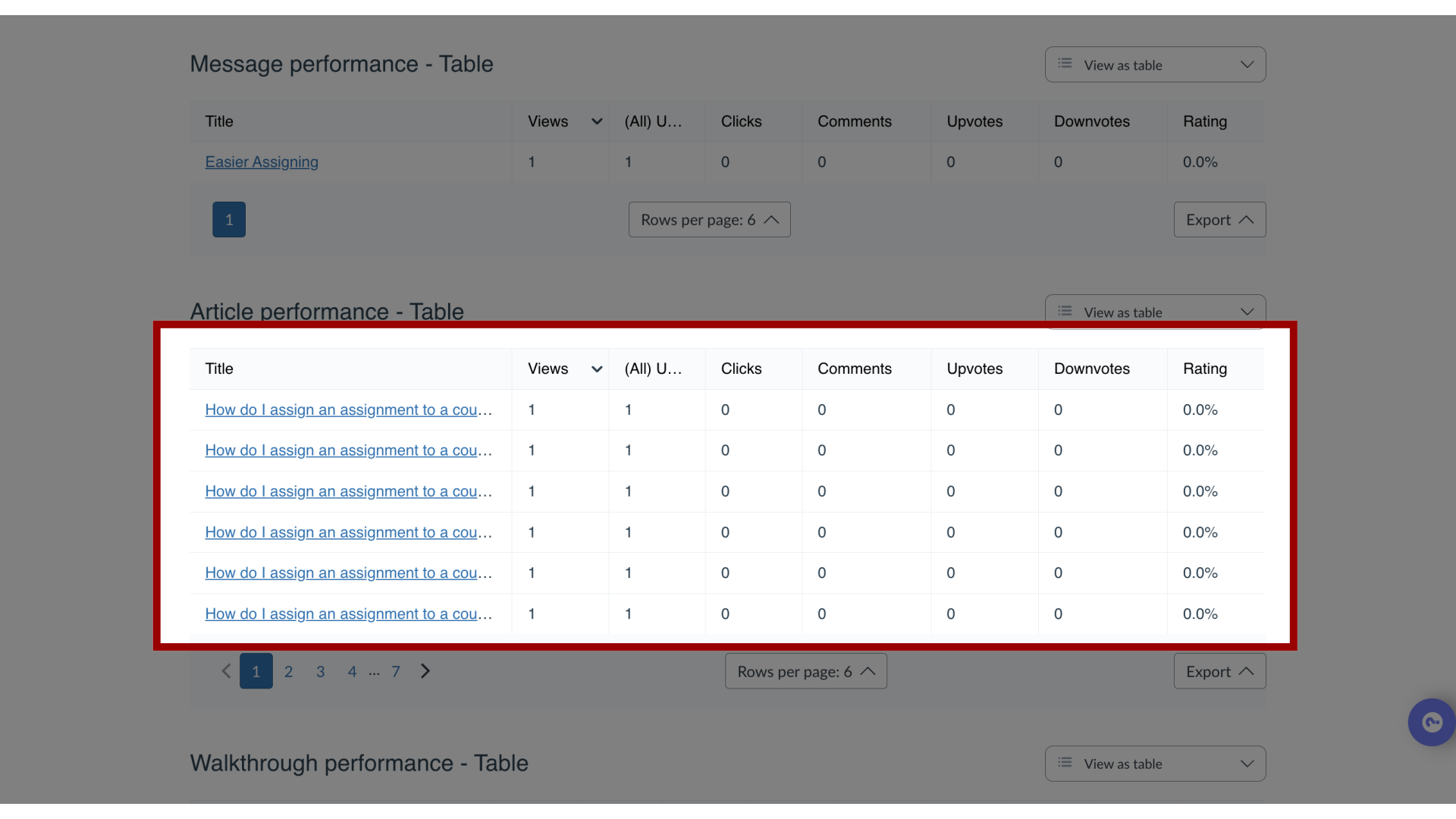
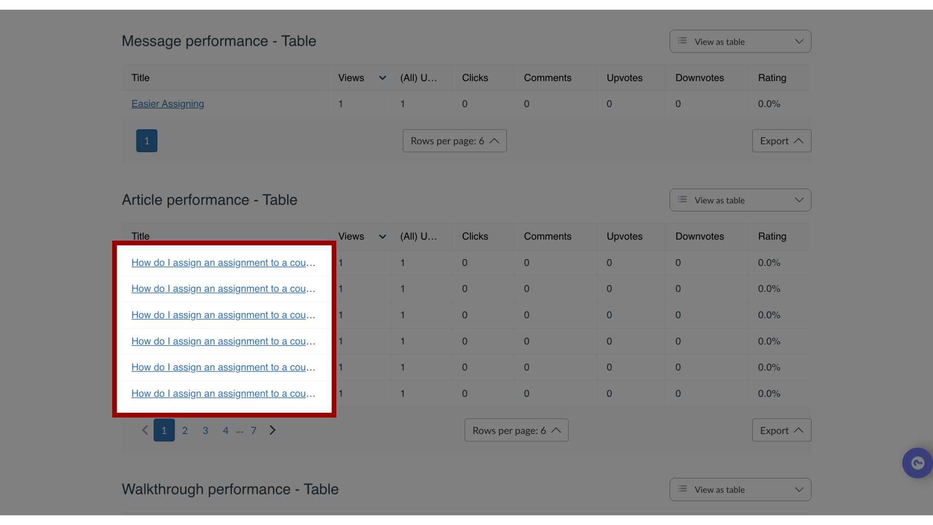
10. Content Engagement
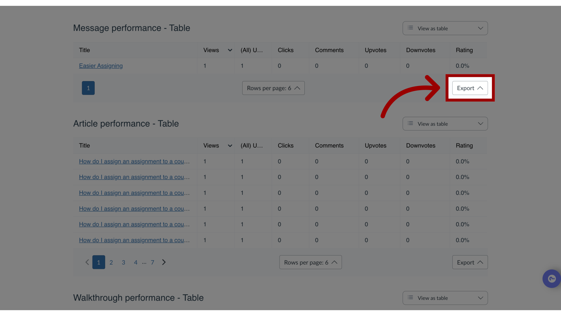
The Campaign Engagement page contains a chart and table showing how heavily the campaign audience is engaging with the assigned messages, support articles, and walkthroughs.
11. Content Engagement Details
12. View More Information
13. Export Content
You can export the contents of the overview as a CSV file by clicking the Export drop-down menu.
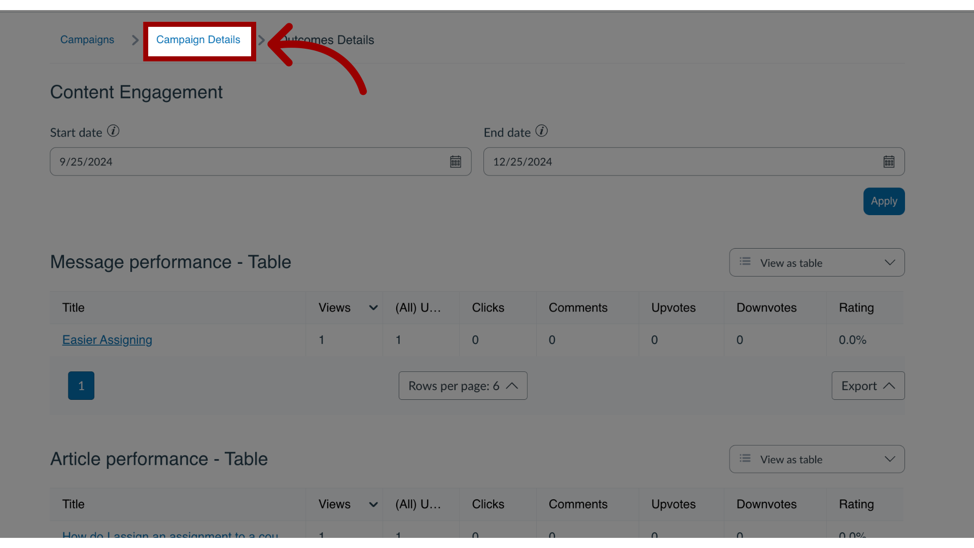
14. Return to Campaign Details
Click the Campaign Details tab to return to the Campaign Details page.
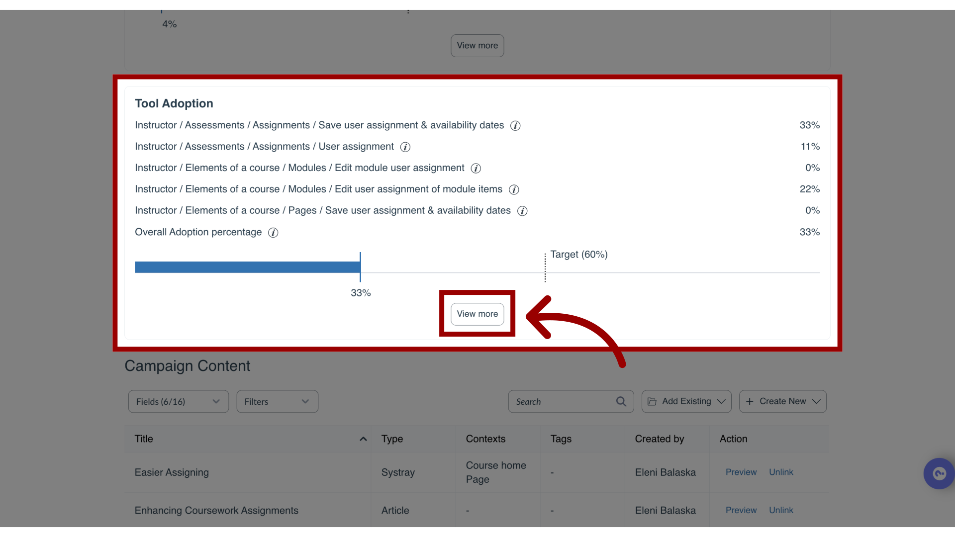
15. View More Tool Adoption
In the Average Tool Adoption section, click the View more link to view the message and article statistics in more detail.
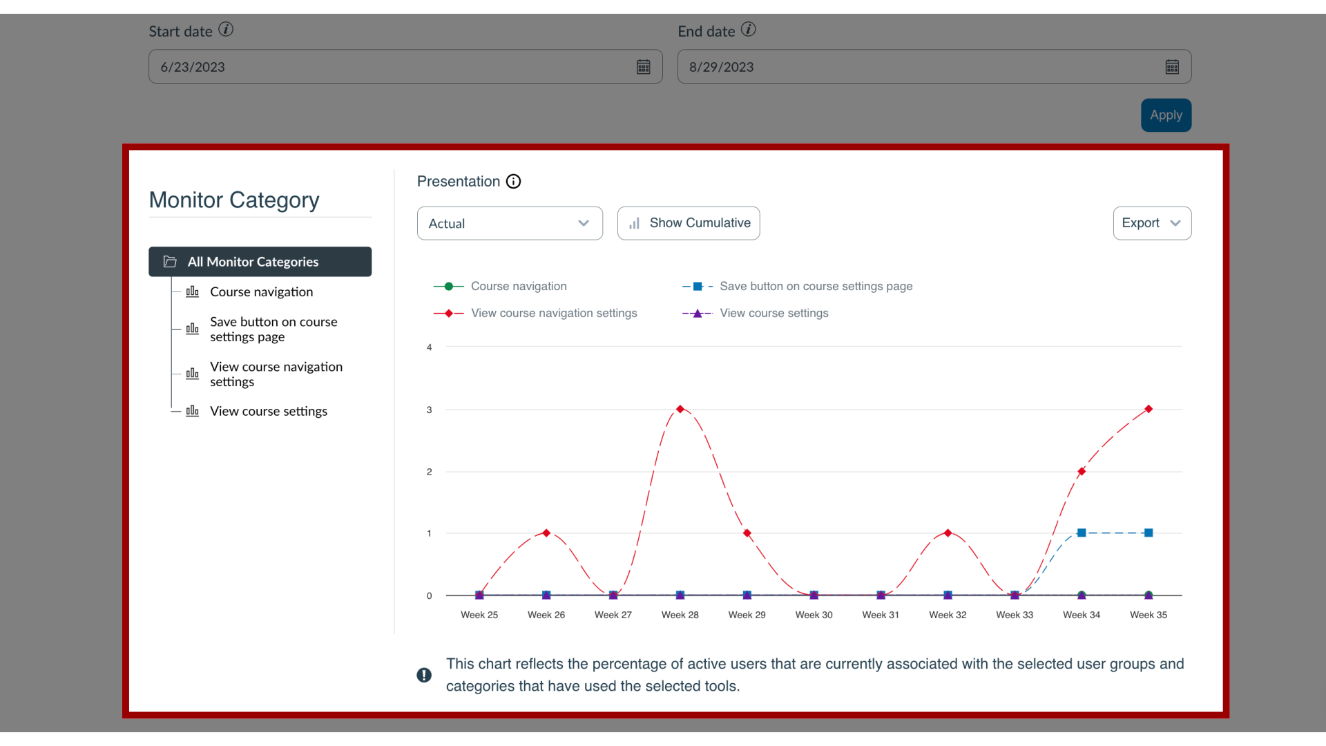
16. View Tool Adoption - Monitor Categories
The Campaign Tool Adoption page contains a chart and table presenting the campaign audience’s activity level within the monitor categories assigned to the campaign.
This allows you to measure the impact of the communication you perform through Impact messaging, support articles, and other means on tool adoption.

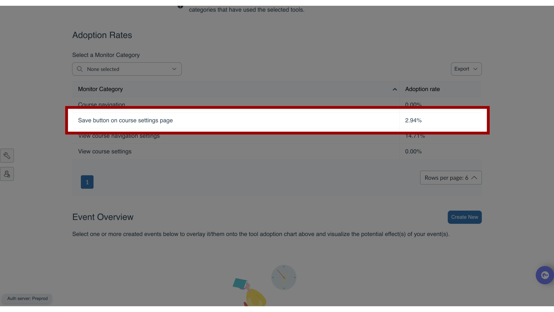
17. View Tool Adoption Rates
The Adoption Rates section consists of a list of all monitor categories that are assigned to the campaign with a consolidated adoption percentage for each monitor (sub-)category.
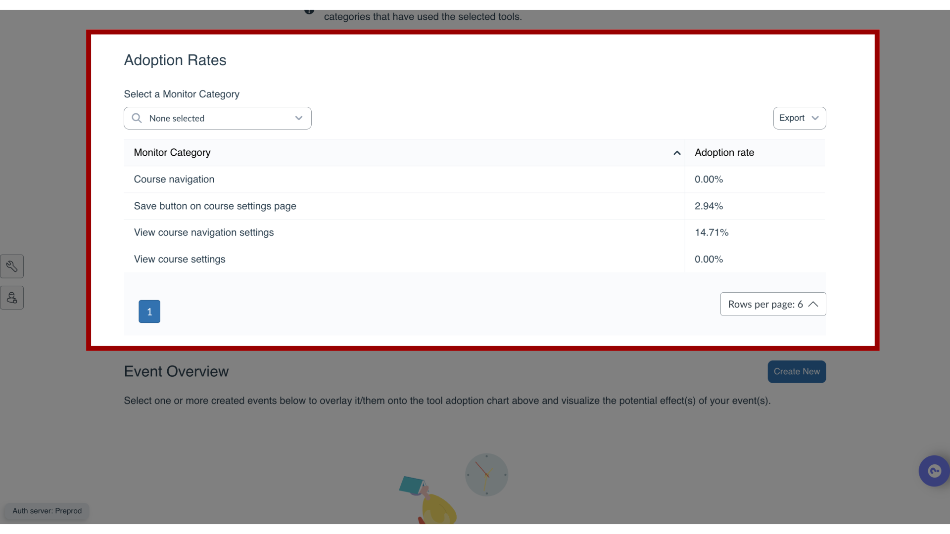
18. Monitor Categories
19. Tool Adoption Rate Calculation
In the chart, the adoption level is calculated for each unit of time, based on the number of active users within that timespan. In the above example, 1830 campaign users have logged into the system over the selected period.
Across the sub-categories that live under the Save Button on Course Settings Page monitor category, 622 unique users have triggered at least one of the underlying monitors. This means that the adoption level for Save Button on Course Settings Page is 2.94%.
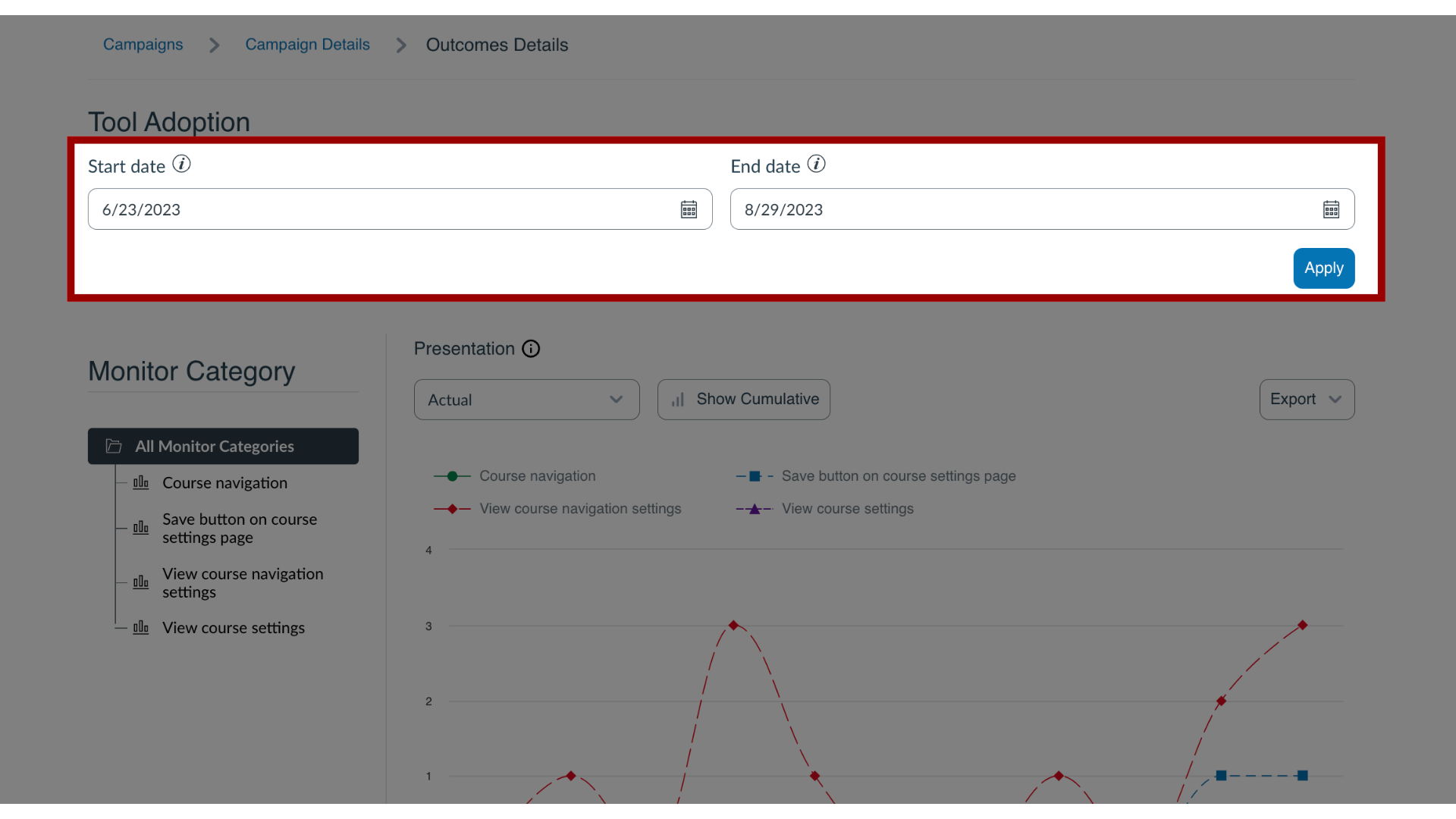
20. Filter Data
These filters allow you to filter the adoption data, views, votes, and clicks based on a specific date range.
By default, the date range is set to a Start Date of three months before the current date or one month before the earliest campaign event and an End Date of today. The selected date range also determines which unit of time is presented on the X-axis of the chart.
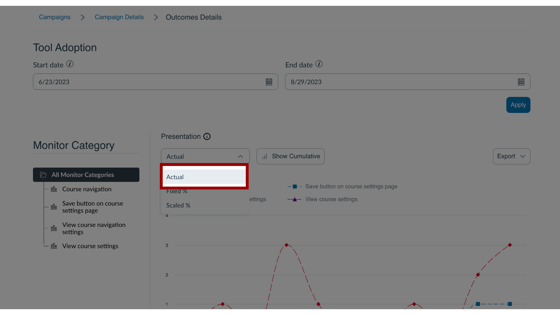
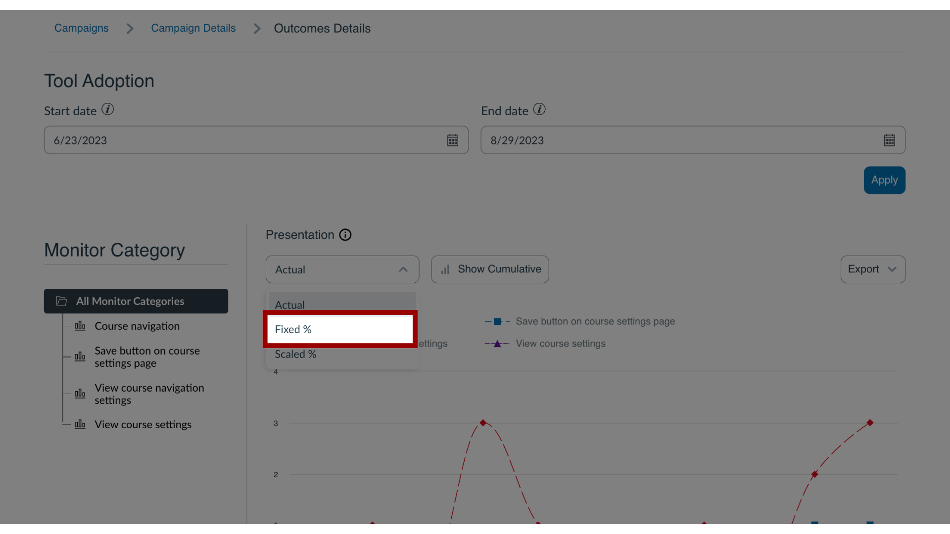
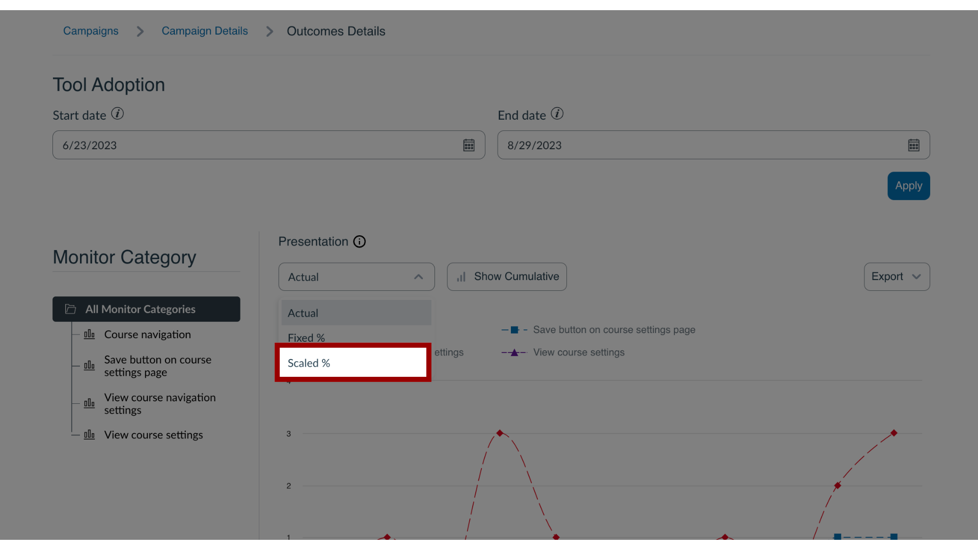
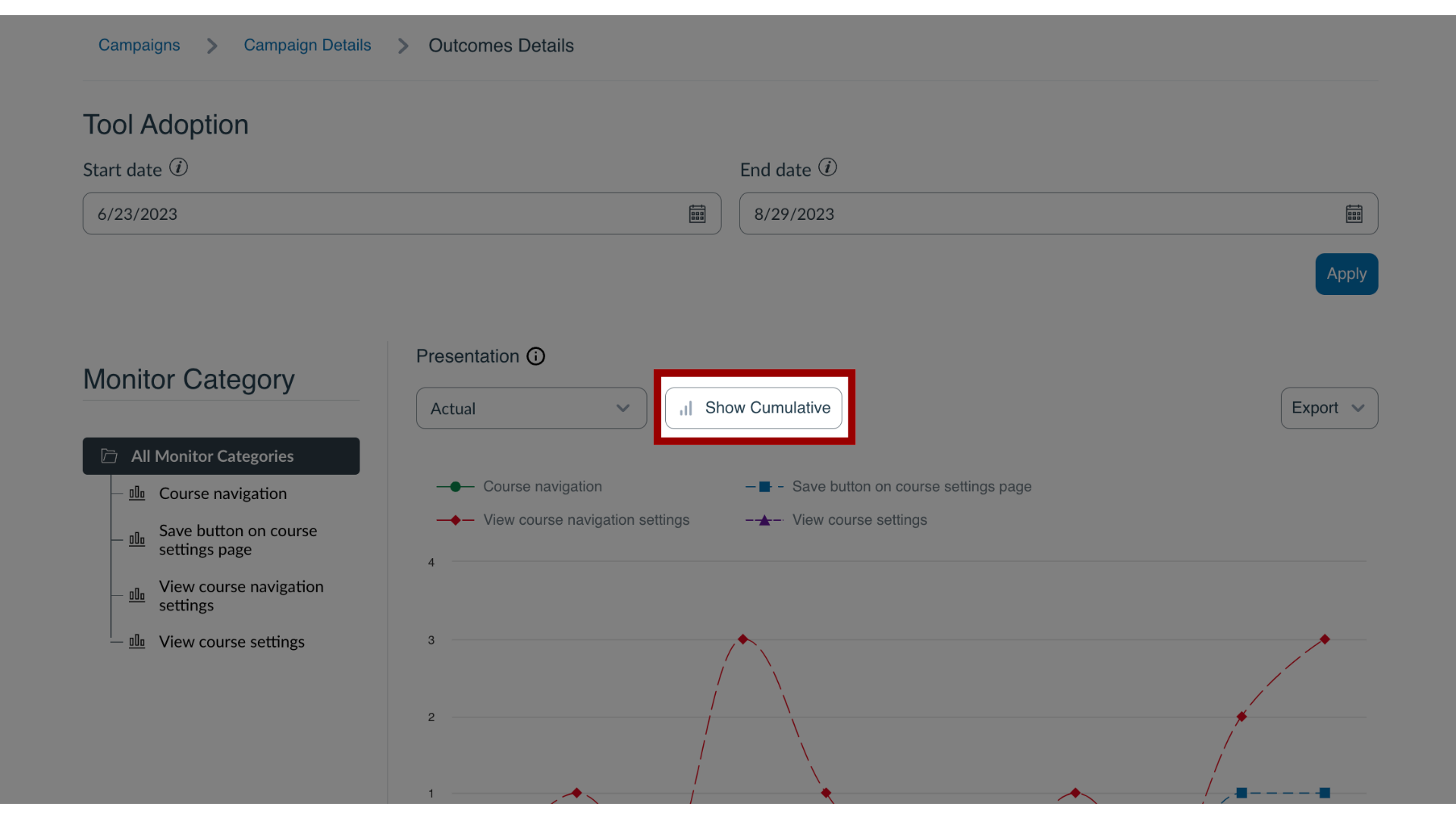
21. Presentation
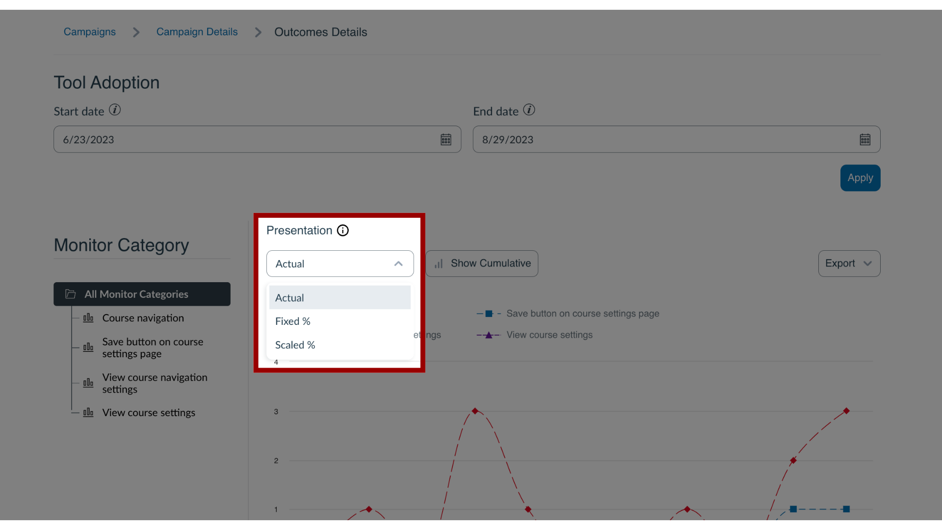
22. Actual Presentation
The Actual numbers option changes the metric shown in the chart from a percentage of campaign users to an absolute number of unique users who used the monitor category (Tool Adoption page) or the absolute number of views, votes, and link clicks on the campaign items (Campaign Engagement page).
23. Fixed % Presentation
Fixed % (default) presents the percentage of users assigned to the campaign who used the monitor category (Tool Adoption page) or viewed, voted on, and clicked any of the campaign items (Campaign Engagement page). The Y-axis of the chart ranges from 0% to 100%. This option shows the calculation as a percentage of the total active users for the selected time period, rounded to two decimal points.
24. Scaled % Presentation
Scaled % shows the same metric as Fixed %, but narrows the Y-axis of the chart to focus on the statistics shown. This option only affects the presentation of the graph and considers usage peaks.
25. Graph Type
For more information on the following referenced topics:
- Insights on Messages: Visit How do I view Insights for a specific message in the Impact Dashboard?
- Article Performance: Visit How do I view article performance in the Impact Dashboard?
